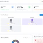










Marketing teams are surrounded by data.
There are website visits to track, campaigns to monitor, leads coming from different channels, customer interactions sitting inside a CRM, and advertising reports arriving from multiple platforms. On paper, having all this information sounds like an advantage.
But there is a catch.
When data is scattered across different tools, it can become surprisingly difficult to understand what is actually working.
A data-driven marketing dashboard can bring that information together. More importantly, it can help a marketing team see where people are engaging, where potential customers are dropping off, and which activities are contributing to conversions.
The trick is to build the dashboard around real marketing questions rather than simply adding every metric available.
What Is a Data-Driven Marketing Dashboard?
A data-driven marketing dashboard is a central view of important marketing performance data.
Instead of checking your website analytics, advertising platforms, CRM, email software, and other tools separately, you can bring selected information into one reporting environment.
A dashboard might show:
- Website traffic
- Leads and qualified leads
- Conversion rates
- Campaign performance
- Advertising costs
- Landing-page results
- Customer acquisition cost
- Marketing pipeline
- Revenue
- Channel performance
The exact metrics will depend on the business.
A B2B company, for example, may care heavily about qualified leads and pipeline. An ecommerce business may focus more on purchases, revenue, average order value, and customer acquisition cost.
So there isn’t one perfect dashboard for every marketing team.
The right dashboard is the one that helps your team understand its own customer journey.
Why a Dashboard Should Focus on Conversions
It is easy to build a dashboard that looks impressive.
You can add traffic charts, impressions, clicks, followers, engagement numbers, and dozens of other metrics. The problem is that these numbers don’t always explain whether marketing is helping the business grow.
Consider a simple example.
Your website traffic increases by 40% in one month. That sounds like good news. But if leads increase by only 2%, there is another part of the story that needs attention.
Maybe the new visitors aren’t the right audience.
Maybe they are finding informational content but aren’t interested in your offer.
Maybe the landing pages aren’t convincing visitors to take the next step.
A conversion-focused dashboard helps expose these gaps.
Instead of asking only:
“How much traffic did we get?”
you can ask:
“What happened after people arrived?”
That is a much more useful marketing question.
Start With One Clear Business Objective
Before choosing charts or connecting data sources, decide what you want the dashboard to help you achieve.
Your objective could be:
- Generate more qualified leads
- Increase website conversions
- Improve campaign efficiency
- Reduce acquisition costs
- Increase marketing-generated revenue
- Understand customer behavior
- Improve the sales funnel
Let’s say your goal is to generate better leads.
In that case, simply tracking website traffic won’t be enough. You may need to monitor visitors, form submissions, qualified leads, conversion rates, and the channels producing those leads.
Starting with the objective keeps the dashboard focused.
Map the Customer Journey
Before selecting KPIs, think about how someone actually becomes a customer.
A typical journey might look like:
Visitor → Engaged User → Lead → Qualified Lead → Opportunity → Customer
Not every business will use these exact stages, but the idea is important.
Imagine that you receive thousands of website visitors every month but very few qualified leads.
That tells you something.
The problem may not be traffic at all. It could be the content, targeting, landing-page experience, offer, or conversion process.
Now imagine that you generate plenty of qualified leads but very few opportunities.
That points to a different part of the journey.
A dashboard becomes more useful when it helps you identify these differences.
Bring the Important Data Together
Marketing data often lives in separate places.
For example, your website analytics may tell you how visitors arrived. Your CRM may tell you what happened to those leads later. Your advertising platform contains spending and campaign information, while your email platform tracks opens, clicks, and interactions.
Useful data sources can include:
- Website analytics
- CRM platforms
- Search tools
- Advertising platforms
- Email marketing software
- Marketing automation systems
- Social media platforms
- Landing-page tools
- Sales systems
You don’t necessarily need to connect everything.
Connect the sources that help you understand the customer journey and measure your business objective.
There is little value in adding data simply because it is available.
Pick KPIs That Tell a Story
A dashboard shouldn’t become a collection of random numbers.
Choose KPIs that help explain what is happening.
Acquisition Metrics
These help you understand how people are finding you:
- Organic traffic
- Paid traffic
- Referral traffic
- Direct traffic
- New visitors
- Campaign visits
Engagement Metrics
These provide context about what visitors do:
- Engaged sessions
- Important page views
- Returning visitors
- Content interactions
- Resource downloads
Conversion Metrics
These show whether visitors are taking meaningful actions:
- Leads
- Qualified leads
- Form submissions
- Demo requests
- Sign-ups
- Conversion rate
Business Metrics
Where reliable data is available, you can connect marketing activity to:
- Pipeline
- Revenue
- Customer acquisition cost
- Revenue by channel
- Return on advertising spend
The important thing is to choose metrics that have a purpose.
If nobody knows why a number is being monitored, it probably doesn’t belong in the main dashboard.
Look at the Funnel, Not Just the Top
One of the most useful things a marketing dashboard can do is show where prospects are being lost.
For example:
10,000 Visitors → 1,000 Leads → 250 Qualified Leads → 80 Opportunities → 25 Customers
Now you have a much clearer picture of the journey.
Perhaps the website is doing a good job generating leads, but only a small percentage are qualified.
Or perhaps lead quality is strong, but opportunities aren’t turning into customers.
Those are very different problems.
Without a funnel view, marketers may simply see the final customer number and start looking for more traffic.
The dashboard can show whether more traffic is actually what the business needs.
Compare Marketing Channels
Your dashboard should make it easier to understand how different channels are performing.
You might compare:
- Organic search
- Paid search
- Social media
- Referral traffic
- Content marketing
- Direct traffic
But don’t compare channels using only clicks or traffic.
Look at what happens after the visit.
For example, one channel might bring 10,000 visitors and generate 100 leads, while another brings 2,000 visitors and generates 120 leads.
The second channel deserves a closer look.
This doesn’t automatically mean it is the better channel. Cost, lead quality, customer value, and the length of the buying cycle may all matter.
The dashboard should give you enough context to ask better questions.
Pay Attention to Landing Pages
A campaign can attract plenty of people and still produce disappointing results.
Sometimes the problem begins after the click.
A visitor reaches the landing page and doesn’t understand the offer. The form feels too long. The page loads slowly. The call to action isn’t obvious. Or the content doesn’t match what the visitor expected from the campaign.
Your dashboard can help you identify pages where this may be happening.
Look for patterns such as:
High traffic + low conversion
or:
Low traffic + strong conversion
The first may need optimization.
The second may deserve more relevant traffic.
The numbers don’t tell you exactly what to change, but they can tell you where to investigate.
Use Attribution Carefully
Customers don’t always follow a straight path.
Someone might discover your brand through search, read a blog article, return through an email campaign, and finally convert after clicking an advertisement.
This makes attribution useful—but also complicated.
Common attribution approaches include:
- First-touch
- Last-touch
- Linear
- Position-based
- Time-decay
- Data-driven
Different models can distribute conversion credit differently.
For that reason, your dashboard should clearly show which attribution approach is being used.
Don’t assume that an attribution figure represents the entire customer journey perfectly. Use it as a way to understand patterns and investigate channel interactions.
Keep the Dashboard Simple
A dashboard should make information easier to understand, not harder.
You don’t need ten charts on every screen.
A simple structure could be:
Marketing Overview
Show the most important business KPIs.
Channel Performance
Compare your main acquisition channels.
Campaign Results
Show campaign traffic, conversions, costs, and other relevant outcomes.
Funnel Performance
Show movement from visitors toward customers.
Trends
Highlight important changes over time.
This makes it possible to understand the bigger picture first and then investigate individual areas when something looks unusual.
Give Your Numbers Context
A single number doesn’t always tell you whether performance is good or bad.
For example:
Conversion Rate: 4.1%
is more useful when you can see:
Previous Month: 3.4%
You can also compare current performance with:
- Monthly targets
- Previous quarters
- Previous years
- Campaign goals
- Internal benchmarks
Context helps prevent teams from overreacting to small changes and makes significant shifts easier to notice.
Create Dashboards for Different Users
Not everyone needs to see the same information.
A marketing leader may want a quick overview of:
- Leads
- Pipeline
- Revenue
- Conversion rate
- Acquisition cost
A campaign manager may need:
- Ad spend
- Campaign conversions
- Audience performance
- Landing-page results
- Cost per conversion
A content marketer might be more interested in:
- Organic traffic
- Content engagement
- Search performance
- Content-driven conversions
Separate dashboard views can make reporting much more useful without overwhelming everyone with unnecessary information.
Make the Dashboard Lead to an Action
This is where many dashboards fall short.
They report what happened but don’t encourage deeper analysis.
Imagine your dashboard shows that organic traffic increased significantly while conversions stayed almost flat.
That should trigger a question.
Why didn’t conversions increase with traffic?
You might investigate:
- Search intent
- Landing pages
- Calls to action
- Content relevance
- Internal linking
- Audience quality
- Conversion paths
Likewise, if a campaign generates many leads but very few qualified leads, you may need to investigate targeting or lead quality.
The dashboard isn’t supposed to make the decision for you.
It should help you find the right problem to investigate.
Common Mistakes to Avoid
Adding Every Available Metric
More information can make a dashboard less useful. Keep the main view focused.
Measuring Traffic Without Outcomes
Traffic is helpful, but it should be connected to engagement, conversions, leads, or other meaningful outcomes.
Ignoring Tracking Problems
Incorrect conversion tracking, inconsistent campaign names, missing parameters, and duplicate data can affect your conclusions.
Using Different Definitions
Make sure everyone agrees on what counts as a lead, qualified lead, conversion, opportunity, and customer.
Leaving the Dashboard Untouched
Your marketing strategy will change. Your dashboard should change with it.
Remove metrics that no longer matter and add measurements when new business questions arise.
A Practical Dashboard-Building Process
If you’re creating a dashboard from scratch, keep the process simple:
1. Define the business goal.
Know exactly what you want to measure.
2. Map the customer journey.
Understand the steps between first interaction and conversion.
3. Identify useful data sources.
Choose the platforms that contain information relevant to your goal.
4. Select your KPIs.
Keep the list focused and meaningful.
5. Build the funnel.
Show where visitors progress and where they drop off.
6. Compare channels and campaigns.
Look beyond traffic and consider conversion outcomes.
7. Add historical context.
Use previous periods and targets where useful.
8. Check data quality.
Make sure your tracking and definitions are consistent.
9. Look for opportunities.
Use unusual changes and gaps as starting points for investigation.
10. Keep improving.
A dashboard should evolve alongside your marketing strategy.
Final Thoughts
A data-driven marketing dashboard is much more than a collection of charts.
When it is built properly, it gives marketers a clearer view of the journey from the first interaction to the final conversion.
It can show where campaigns are gaining traction, where prospects are dropping off, which pages deserve attention, and where the marketing team should look for improvement opportunities.
The goal isn’t to display every piece of data your MarTech stack can collect.
The goal is to make the right information easier to understand.
When marketers can move from data to insight and from insight to meaningful action, the dashboard becomes more than a reporting tool. It becomes part of the marketing decision-making process.Marketing teams are surrounded by data.
There are website visits to track, campaigns to monitor, leads coming from different channels, customer interactions sitting inside a CRM, and advertising reports arriving from multiple platforms. On paper, having all this information sounds like an advantage.
But there is a catch.
When data is scattered across different tools, it can become surprisingly difficult to understand what is actually working.
A data-driven marketing dashboard can bring that information together. More importantly, it can help a marketing team see where people are engaging, where potential customers are dropping off, and which activities are contributing to conversions.
The trick is to build the dashboard around real marketing questions rather than simply adding every metric available.
What Is a Data-Driven Marketing Dashboard?
A data-driven marketing dashboard is a central view of important marketing performance data.
Instead of checking your website analytics, advertising platforms, CRM, email software, and other tools separately, you can bring selected information into one reporting environment.
A dashboard might show:
- Website traffic
- Leads and qualified leads
- Conversion rates
- Campaign performance
- Advertising costs
- Landing-page results
- Customer acquisition cost
- Marketing pipeline
- Revenue
- Channel performance
The exact metrics will depend on the business.
A B2B company, for example, may care heavily about qualified leads and pipeline. An ecommerce business may focus more on purchases, revenue, average order value, and customer acquisition cost.
So there isn’t one perfect dashboard for every marketing team.
The right dashboard is the one that helps your team understand its own customer journey.
Why a Dashboard Should Focus on Conversions
It is easy to build a dashboard that looks impressive.
You can add traffic charts, impressions, clicks, followers, engagement numbers, and dozens of other metrics. The problem is that these numbers don’t always explain whether marketing is helping the business grow.
Consider a simple example.
Your website traffic increases by 40% in one month. That sounds like good news. But if leads increase by only 2%, there is another part of the story that needs attention.
Maybe the new visitors aren’t the right audience.
Maybe they are finding informational content but aren’t interested in your offer.
Maybe the landing pages aren’t convincing visitors to take the next step.
A conversion-focused dashboard helps expose these gaps.
Instead of asking only:
“How much traffic did we get?”
you can ask:
“What happened after people arrived?”
That is a much more useful marketing question.
Start With One Clear Business Objective
Before choosing charts or connecting data sources, decide what you want the dashboard to help you achieve.
Your objective could be:
- Generate more qualified leads
- Increase website conversions
- Improve campaign efficiency
- Reduce acquisition costs
- Increase marketing-generated revenue
- Understand customer behavior
- Improve the sales funnel
Let’s say your goal is to generate better leads.
In that case, simply tracking website traffic won’t be enough. You may need to monitor visitors, form submissions, qualified leads, conversion rates, and the channels producing those leads.
Starting with the objective keeps the dashboard focused.
Map the Customer Journey
Before selecting KPIs, think about how someone actually becomes a customer.
A typical journey might look like:
Visitor → Engaged User → Lead → Qualified Lead → Opportunity → Customer
Not every business will use these exact stages, but the idea is important.
Imagine that you receive thousands of website visitors every month but very few qualified leads.
That tells you something.
The problem may not be traffic at all. It could be the content, targeting, landing-page experience, offer, or conversion process.
Now imagine that you generate plenty of qualified leads but very few opportunities.
That points to a different part of the journey.
A dashboard becomes more useful when it helps you identify these differences.
Bring the Important Data Together
Marketing data often lives in separate places.
For example, your website analytics may tell you how visitors arrived. Your CRM may tell you what happened to those leads later. Your advertising platform contains spending and campaign information, while your email platform tracks opens, clicks, and interactions.
Useful data sources can include:
- Website analytics
- CRM platforms
- Search tools
- Advertising platforms
- Email marketing software
- Marketing automation systems
- Social media platforms
- Landing-page tools
- Sales systems
You don’t necessarily need to connect everything.
Connect the sources that help you understand the customer journey and measure your business objective.
There is little value in adding data simply because it is available.
Pick KPIs That Tell a Story
A dashboard shouldn’t become a collection of random numbers.
Choose KPIs that help explain what is happening.
Acquisition Metrics
These help you understand how people are finding you:
- Organic traffic
- Paid traffic
- Referral traffic
- Direct traffic
- New visitors
- Campaign visits
Engagement Metrics
These provide context about what visitors do:
- Engaged sessions
- Important page views
- Returning visitors
- Content interactions
- Resource downloads
Conversion Metrics
These show whether visitors are taking meaningful actions:
- Leads
- Qualified leads
- Form submissions
- Demo requests
- Sign-ups
- Conversion rate
Business Metrics
Where reliable data is available, you can connect marketing activity to:
- Pipeline
- Revenue
- Customer acquisition cost
- Revenue by channel
- Return on advertising spend
The important thing is to choose metrics that have a purpose.
If nobody knows why a number is being monitored, it probably doesn’t belong in the main dashboard.
Look at the Funnel, Not Just the Top
One of the most useful things a marketing dashboard can do is show where prospects are being lost.
For example:
10,000 Visitors → 1,000 Leads → 250 Qualified Leads → 80 Opportunities → 25 Customers
Now you have a much clearer picture of the journey.
Perhaps the website is doing a good job generating leads, but only a small percentage are qualified.
Or perhaps lead quality is strong, but opportunities aren’t turning into customers.
Those are very different problems.
Without a funnel view, marketers may simply see the final customer number and start looking for more traffic.
The dashboard can show whether more traffic is actually what the business needs.
Compare Marketing Channels
Your dashboard should make it easier to understand how different channels are performing.
You might compare:
- Organic search
- Paid search
- Social media
- Referral traffic
- Content marketing
- Direct traffic
But don’t compare channels using only clicks or traffic.
Look at what happens after the visit.
For example, one channel might bring 10,000 visitors and generate 100 leads, while another brings 2,000 visitors and generates 120 leads.
The second channel deserves a closer look.
This doesn’t automatically mean it is the better channel. Cost, lead quality, customer value, and the length of the buying cycle may all matter.
The dashboard should give you enough context to ask better questions.
Pay Attention to Landing Pages
A campaign can attract plenty of people and still produce disappointing results.
Sometimes the problem begins after the click.
A visitor reaches the landing page and doesn’t understand the offer. The form feels too long. The page loads slowly. The call to action isn’t obvious. Or the content doesn’t match what the visitor expected from the campaign.
Your dashboard can help you identify pages where this may be happening.
Look for patterns such as:
High traffic + low conversion
or:
Low traffic + strong conversion
The first may need optimization.
The second may deserve more relevant traffic.
The numbers don’t tell you exactly what to change, but they can tell you where to investigate.
Use Attribution Carefully
Customers don’t always follow a straight path.
Someone might discover your brand through search, read a blog article, return through an email campaign, and finally convert after clicking an advertisement.
This makes attribution useful—but also complicated.
Common attribution approaches include:
- First-touch
- Last-touch
- Linear
- Position-based
- Time-decay
- Data-driven
Different models can distribute conversion credit differently.
For that reason, your dashboard should clearly show which attribution approach is being used.
Don’t assume that an attribution figure represents the entire customer journey perfectly. Use it as a way to understand patterns and investigate channel interactions.
Keep the Dashboard Simple
A dashboard should make information easier to understand, not harder.
You don’t need ten charts on every screen.
A simple structure could be:
Marketing Overview
Show the most important business KPIs.
Channel Performance
Compare your main acquisition channels.
Campaign Results
Show campaign traffic, conversions, costs, and other relevant outcomes.
Funnel Performance
Show movement from visitors toward customers.
Trends
Highlight important changes over time.
This makes it possible to understand the bigger picture first and then investigate individual areas when something looks unusual.
Give Your Numbers Context
A single number doesn’t always tell you whether performance is good or bad.
For example:
Conversion Rate: 4.1%
is more useful when you can see:
Previous Month: 3.4%
You can also compare current performance with:
- Monthly targets
- Previous quarters
- Previous years
- Campaign goals
- Internal benchmarks
Context helps prevent teams from overreacting to small changes and makes significant shifts easier to notice.
Create Dashboards for Different Users
Not everyone needs to see the same information.
A marketing leader may want a quick overview of:
- Leads
- Pipeline
- Revenue
- Conversion rate
- Acquisition cost
A campaign manager may need:
- Ad spend
- Campaign conversions
- Audience performance
- Landing-page results
- Cost per conversion
A content marketer might be more interested in:
- Organic traffic
- Content engagement
- Search performance
- Content-driven conversions
Separate dashboard views can make reporting much more useful without overwhelming everyone with unnecessary information.
Make the Dashboard Lead to an Action
This is where many dashboards fall short.
They report what happened but don’t encourage deeper analysis.
Imagine your dashboard shows that organic traffic increased significantly while conversions stayed almost flat.
That should trigger a question.
Why didn’t conversions increase with traffic?
You might investigate:
- Search intent
- Landing pages
- Calls to action
- Content relevance
- Internal linking
- Audience quality
- Conversion paths
Likewise, if a campaign generates many leads but very few qualified leads, you may need to investigate targeting or lead quality.
The dashboard isn’t supposed to make the decision for you.
It should help you find the right problem to investigate.
Common Mistakes to Avoid
Adding Every Available Metric
More information can make a dashboard less useful. Keep the main view focused.
Measuring Traffic Without Outcomes
Traffic is helpful, but it should be connected to engagement, conversions, leads, or other meaningful outcomes.
Ignoring Tracking Problems
Incorrect conversion tracking, inconsistent campaign names, missing parameters, and duplicate data can affect your conclusions.
Using Different Definitions
Make sure everyone agrees on what counts as a lead, qualified lead, conversion, opportunity, and customer.
Leaving the Dashboard Untouched
Your marketing strategy will change. Your dashboard should change with it.
Remove metrics that no longer matter and add measurements when new business questions arise.
A Practical Dashboard-Building Process
If you’re creating a dashboard from scratch, keep the process simple:
1. Define the business goal.
Know exactly what you want to measure.
2. Map the customer journey.
Understand the steps between first interaction and conversion.
3. Identify useful data sources.
Choose the platforms that contain information relevant to your goal.
4. Select your KPIs.
Keep the list focused and meaningful.
5. Build the funnel.
Show where visitors progress and where they drop off.
6. Compare channels and campaigns.
Look beyond traffic and consider conversion outcomes.
7. Add historical context.
Use previous periods and targets where useful.
8. Check data quality.
Make sure your tracking and definitions are consistent.
9. Look for opportunities.
Use unusual changes and gaps as starting points for investigation.
10. Keep improving.
A dashboard should evolve alongside your marketing strategy.
Final Thoughts
A data-driven marketing dashboard is much more than a collection of charts.
When it is built properly, it gives marketers a clearer view of the journey from the first interaction to the final conversion.
It can show where campaigns are gaining traction, where prospects are dropping off, which pages deserve attention, and where the marketing team should look for improvement opportunities.
The goal isn’t to display every piece of data your MarTech stack can collect.
The goal is to make the right information easier to understand.
When marketers can move from data to insight and from insight to meaningful action, the dashboard becomes more than a reporting tool. It becomes part of the marketing decision-making process.Marketing teams are surrounded by data.
There are website visits to track, campaigns to monitor, leads coming from different channels, customer interactions sitting inside a CRM, and advertising reports arriving from multiple platforms. On paper, having all this information sounds like an advantage.
But there is a catch.
When data is scattered across different tools, it can become surprisingly difficult to understand what is actually working.
A data-driven marketing dashboard can bring that information together. More importantly, it can help a marketing team see where people are engaging, where potential customers are dropping off, and which activities are contributing to conversions.
The trick is to build the dashboard around real marketing questions rather than simply adding every metric available.
What Is a Data-Driven Marketing Dashboard?
A data-driven marketing dashboard is a central view of important marketing performance data.
Instead of checking your website analytics, advertising platforms, CRM, email software, and other tools separately, you can bring selected information into one reporting environment.
A dashboard might show:
- Website traffic
- Leads and qualified leads
- Conversion rates
- Campaign performance
- Advertising costs
- Landing-page results
- Customer acquisition cost
- Marketing pipeline
- Revenue
- Channel performance
The exact metrics will depend on the business.
A B2B company, for example, may care heavily about qualified leads and pipeline. An ecommerce business may focus more on purchases, revenue, average order value, and customer acquisition cost.
So there isn’t one perfect dashboard for every marketing team.
The right dashboard is the one that helps your team understand its own customer journey.
Why a Dashboard Should Focus on Conversions
It is easy to build a dashboard that looks impressive.
You can add traffic charts, impressions, clicks, followers, engagement numbers, and dozens of other metrics. The problem is that these numbers don’t always explain whether marketing is helping the business grow.
Consider a simple example.
Your website traffic increases by 40% in one month. That sounds like good news. But if leads increase by only 2%, there is another part of the story that needs attention.
Maybe the new visitors aren’t the right audience.
Maybe they are finding informational content but aren’t interested in your offer.
Maybe the landing pages aren’t convincing visitors to take the next step.
A conversion-focused dashboard helps expose these gaps.
Instead of asking only:
“How much traffic did we get?”
you can ask:
“What happened after people arrived?”
That is a much more useful marketing question.
Start With One Clear Business Objective
Before choosing charts or connecting data sources, decide what you want the dashboard to help you achieve.
Your objective could be:
- Generate more qualified leads
- Increase website conversions
- Improve campaign efficiency
- Reduce acquisition costs
- Increase marketing-generated revenue
- Understand customer behavior
- Improve the sales funnel
Let’s say your goal is to generate better leads.
In that case, simply tracking website traffic won’t be enough. You may need to monitor visitors, form submissions, qualified leads, conversion rates, and the channels producing those leads.
Starting with the objective keeps the dashboard focused.
Map the Customer Journey
Before selecting KPIs, think about how someone actually becomes a customer.
A typical journey might look like:
Visitor → Engaged User → Lead → Qualified Lead → Opportunity → Customer
Not every business will use these exact stages, but the idea is important.
Imagine that you receive thousands of website visitors every month but very few qualified leads.
That tells you something.
The problem may not be traffic at all. It could be the content, targeting, landing-page experience, offer, or conversion process.
Now imagine that you generate plenty of qualified leads but very few opportunities.
That points to a different part of the journey.
A dashboard becomes more useful when it helps you identify these differences.
Bring the Important Data Together
Marketing data often lives in separate places.
For example, your website analytics may tell you how visitors arrived. Your CRM may tell you what happened to those leads later. Your advertising platform contains spending and campaign information, while your email platform tracks opens, clicks, and interactions.
Useful data sources can include:
- Website analytics
- CRM platforms
- Search tools
- Advertising platforms
- Email marketing software
- Marketing automation systems
- Social media platforms
- Landing-page tools
- Sales systems
You don’t necessarily need to connect everything.
Connect the sources that help you understand the customer journey and measure your business objective.
There is little value in adding data simply because it is available.
Pick KPIs That Tell a Story
A dashboard shouldn’t become a collection of random numbers.
Choose KPIs that help explain what is happening.
Acquisition Metrics
These help you understand how people are finding you:
- Organic traffic
- Paid traffic
- Referral traffic
- Direct traffic
- New visitors
- Campaign visits
Engagement Metrics
These provide context about what visitors do:
- Engaged sessions
- Important page views
- Returning visitors
- Content interactions
- Resource downloads
Conversion Metrics
These show whether visitors are taking meaningful actions:
- Leads
- Qualified leads
- Form submissions
- Demo requests
- Sign-ups
- Conversion rate
Business Metrics
Where reliable data is available, you can connect marketing activity to:
- Pipeline
- Revenue
- Customer acquisition cost
- Revenue by channel
- Return on advertising spend
The important thing is to choose metrics that have a purpose.
If nobody knows why a number is being monitored, it probably doesn’t belong in the main dashboard.
Look at the Funnel, Not Just the Top
One of the most useful things a marketing dashboard can do is show where prospects are being lost.
For example:
10,000 Visitors → 1,000 Leads → 250 Qualified Leads → 80 Opportunities → 25 Customers
Now you have a much clearer picture of the journey.
Perhaps the website is doing a good job generating leads, but only a small percentage are qualified.
Or perhaps lead quality is strong, but opportunities aren’t turning into customers.
Those are very different problems.
Without a funnel view, marketers may simply see the final customer number and start looking for more traffic.
The dashboard can show whether more traffic is actually what the business needs.
Compare Marketing Channels
Your dashboard should make it easier to understand how different channels are performing.
You might compare:
- Organic search
- Paid search
- Social media
- Referral traffic
- Content marketing
- Direct traffic
But don’t compare channels using only clicks or traffic.
Look at what happens after the visit.
For example, one channel might bring 10,000 visitors and generate 100 leads, while another brings 2,000 visitors and generates 120 leads.
The second channel deserves a closer look.
This doesn’t automatically mean it is the better channel. Cost, lead quality, customer value, and the length of the buying cycle may all matter.
The dashboard should give you enough context to ask better questions.
Pay Attention to Landing Pages
A campaign can attract plenty of people and still produce disappointing results.
Sometimes the problem begins after the click.
A visitor reaches the landing page and doesn’t understand the offer. The form feels too long. The page loads slowly. The call to action isn’t obvious. Or the content doesn’t match what the visitor expected from the campaign.
Your dashboard can help you identify pages where this may be happening.
Look for patterns such as:
High traffic + low conversion
or:
Low traffic + strong conversion
The first may need optimization.
The second may deserve more relevant traffic.
The numbers don’t tell you exactly what to change, but they can tell you where to investigate.
Use Attribution Carefully
Customers don’t always follow a straight path.
Someone might discover your brand through search, read a blog article, return through an email campaign, and finally convert after clicking an advertisement.
This makes attribution useful—but also complicated.
Common attribution approaches include:
- First-touch
- Last-touch
- Linear
- Position-based
- Time-decay
- Data-driven
Different models can distribute conversion credit differently.
For that reason, your dashboard should clearly show which attribution approach is being used.
Don’t assume that an attribution figure represents the entire customer journey perfectly. Use it as a way to understand patterns and investigate channel interactions.
Keep the Dashboard Simple
A dashboard should make information easier to understand, not harder.
You don’t need ten charts on every screen.
A simple structure could be:
Marketing Overview
Show the most important business KPIs.
Channel Performance
Compare your main acquisition channels.
Campaign Results
Show campaign traffic, conversions, costs, and other relevant outcomes.
Funnel Performance
Show movement from visitors toward customers.
Trends
Highlight important changes over time.
This makes it possible to understand the bigger picture first and then investigate individual areas when something looks unusual.
Give Your Numbers Context
A single number doesn’t always tell you whether performance is good or bad.
For example:
Conversion Rate: 4.1%
is more useful when you can see:
Previous Month: 3.4%
You can also compare current performance with:
- Monthly targets
- Previous quarters
- Previous years
- Campaign goals
- Internal benchmarks
Context helps prevent teams from overreacting to small changes and makes significant shifts easier to notice.
Create Dashboards for Different Users
Not everyone needs to see the same information.
A marketing leader may want a quick overview of:
- Leads
- Pipeline
- Revenue
- Conversion rate
- Acquisition cost
A campaign manager may need:
- Ad spend
- Campaign conversions
- Audience performance
- Landing-page results
- Cost per conversion
A content marketer might be more interested in:
- Organic traffic
- Content engagement
- Search performance
- Content-driven conversions
Separate dashboard views can make reporting much more useful without overwhelming everyone with unnecessary information.
Make the Dashboard Lead to an Action
This is where many dashboards fall short.
They report what happened but don’t encourage deeper analysis.
Imagine your dashboard shows that organic traffic increased significantly while conversions stayed almost flat.
That should trigger a question.
Why didn’t conversions increase with traffic?
You might investigate:
- Search intent
- Landing pages
- Calls to action
- Content relevance
- Internal linking
- Audience quality
- Conversion paths
Likewise, if a campaign generates many leads but very few qualified leads, you may need to investigate targeting or lead quality.
The dashboard isn’t supposed to make the decision for you.
It should help you find the right problem to investigate.
Common Mistakes to Avoid
Adding Every Available Metric
More information can make a dashboard less useful. Keep the main view focused.
Measuring Traffic Without Outcomes
Traffic is helpful, but it should be connected to engagement, conversions, leads, or other meaningful outcomes.
Ignoring Tracking Problems
Incorrect conversion tracking, inconsistent campaign names, missing parameters, and duplicate data can affect your conclusions.
Using Different Definitions
Make sure everyone agrees on what counts as a lead, qualified lead, conversion, opportunity, and customer.
Leaving the Dashboard Untouched
Your marketing strategy will change. Your dashboard should change with it.
Remove metrics that no longer matter and add measurements when new business questions arise.
A Practical Dashboard-Building Process
If you’re creating a dashboard from scratch, keep the process simple:
1. Define the business goal.
Know exactly what you want to measure.
2. Map the customer journey.
Understand the steps between first interaction and conversion.
3. Identify useful data sources.
Choose the platforms that contain information relevant to your goal.
4. Select your KPIs.
Keep the list focused and meaningful.
5. Build the funnel.
Show where visitors progress and where they drop off.
6. Compare channels and campaigns.
Look beyond traffic and consider conversion outcomes.
7. Add historical context.
Use previous periods and targets where useful.
8. Check data quality.
Make sure your tracking and definitions are consistent.
9. Look for opportunities.
Use unusual changes and gaps as starting points for investigation.
10. Keep improving.
A dashboard should evolve alongside your marketing strategy.
Final Thoughts
A data-driven marketing dashboard is much more than a collection of charts.
When it is built properly, it gives marketers a clearer view of the journey from the first interaction to the final conversion.
It can show where campaigns are gaining traction, where prospects are dropping off, which pages deserve attention, and where the marketing team should look for improvement opportunities.
The goal isn’t to display every piece of data your MarTech stack can collect.
The goal is to make the right information easier to understand.
When marketers can move from data to insight and from insight to meaningful action, the dashboard becomes more than a reporting tool. It becomes part of the marketing decision-making process.Marketing teams are surrounded by data.
There are website visits to track, campaigns to monitor, leads coming from different channels, customer interactions sitting inside a CRM, and advertising reports arriving from multiple platforms. On paper, having all this information sounds like an advantage.
But there is a catch.
When data is scattered across different tools, it can become surprisingly difficult to understand what is actually working.
A data-driven marketing dashboard can bring that information together. More importantly, it can help a marketing team see where people are engaging, where potential customers are dropping off, and which activities are contributing to conversions.
The trick is to build the dashboard around real marketing questions rather than simply adding every metric available.
What Is a Data-Driven Marketing Dashboard?
A data-driven marketing dashboard is a central view of important marketing performance data.
Instead of checking your website analytics, advertising platforms, CRM, email software, and other tools separately, you can bring selected information into one reporting environment.
A dashboard might show:
- Website traffic
- Leads and qualified leads
- Conversion rates
- Campaign performance
- Advertising costs
- Landing-page results
- Customer acquisition cost
- Marketing pipeline
- Revenue
- Channel performance
The exact metrics will depend on the business.
A B2B company, for example, may care heavily about qualified leads and pipeline. An ecommerce business may focus more on purchases, revenue, average order value, and customer acquisition cost.
So there isn’t one perfect dashboard for every marketing team.
The right dashboard is the one that helps your team understand its own customer journey.
Why a Dashboard Should Focus on Conversions
It is easy to build a dashboard that looks impressive.
You can add traffic charts, impressions, clicks, followers, engagement numbers, and dozens of other metrics. The problem is that these numbers don’t always explain whether marketing is helping the business grow.
Consider a simple example.
Your website traffic increases by 40% in one month. That sounds like good news. But if leads increase by only 2%, there is another part of the story that needs attention.
Maybe the new visitors aren’t the right audience.
Maybe they are finding informational content but aren’t interested in your offer.
Maybe the landing pages aren’t convincing visitors to take the next step.
A conversion-focused dashboard helps expose these gaps.
Instead of asking only:
“How much traffic did we get?”
you can ask:
“What happened after people arrived?”
That is a much more useful marketing question.
Start With One Clear Business Objective
Before choosing charts or connecting data sources, decide what you want the dashboard to help you achieve.
Your objective could be:
- Generate more qualified leads
- Increase website conversions
- Improve campaign efficiency
- Reduce acquisition costs
- Increase marketing-generated revenue
- Understand customer behavior
- Improve the sales funnel
Let’s say your goal is to generate better leads.
In that case, simply tracking website traffic won’t be enough. You may need to monitor visitors, form submissions, qualified leads, conversion rates, and the channels producing those leads.
Starting with the objective keeps the dashboard focused.
Map the Customer Journey
Before selecting KPIs, think about how someone actually becomes a customer.
A typical journey might look like:
Visitor → Engaged User → Lead → Qualified Lead → Opportunity → Customer
Not every business will use these exact stages, but the idea is important.
Imagine that you receive thousands of website visitors every month but very few qualified leads.
That tells you something.
The problem may not be traffic at all. It could be the content, targeting, landing-page experience, offer, or conversion process.
Now imagine that you generate plenty of qualified leads but very few opportunities.
That points to a different part of the journey.
A dashboard becomes more useful when it helps you identify these differences.
Bring the Important Data Together
Marketing data often lives in separate places.
For example, your website analytics may tell you how visitors arrived. Your CRM may tell you what happened to those leads later. Your advertising platform contains spending and campaign information, while your email platform tracks opens, clicks, and interactions.
Useful data sources can include:
- Website analytics
- CRM platforms
- Search tools
- Advertising platforms
- Email marketing software
- Marketing automation systems
- Social media platforms
- Landing-page tools
- Sales systems
You don’t necessarily need to connect everything.
Connect the sources that help you understand the customer journey and measure your business objective.
There is little value in adding data simply because it is available.
Pick KPIs That Tell a Story
A dashboard shouldn’t become a collection of random numbers.
Choose KPIs that help explain what is happening.
Acquisition Metrics
These help you understand how people are finding you:
- Organic traffic
- Paid traffic
- Referral traffic
- Direct traffic
- New visitors
- Campaign visits
Engagement Metrics
These provide context about what visitors do:
- Engaged sessions
- Important page views
- Returning visitors
- Content interactions
- Resource downloads
Conversion Metrics
These show whether visitors are taking meaningful actions:
- Leads
- Qualified leads
- Form submissions
- Demo requests
- Sign-ups
- Conversion rate
Business Metrics
Where reliable data is available, you can connect marketing activity to:
- Pipeline
- Revenue
- Customer acquisition cost
- Revenue by channel
- Return on advertising spend
The important thing is to choose metrics that have a purpose.
If nobody knows why a number is being monitored, it probably doesn’t belong in the main dashboard.
Look at the Funnel, Not Just the Top
One of the most useful things a marketing dashboard can do is show where prospects are being lost.
For example:
10,000 Visitors → 1,000 Leads → 250 Qualified Leads → 80 Opportunities → 25 Customers
Now you have a much clearer picture of the journey.
Perhaps the website is doing a good job generating leads, but only a small percentage are qualified.
Or perhaps lead quality is strong, but opportunities aren’t turning into customers.
Those are very different problems.
Without a funnel view, marketers may simply see the final customer number and start looking for more traffic.
The dashboard can show whether more traffic is actually what the business needs.
Compare Marketing Channels
Your dashboard should make it easier to understand how different channels are performing.
You might compare:
- Organic search
- Paid search
- Social media
- Referral traffic
- Content marketing
- Direct traffic
But don’t compare channels using only clicks or traffic.
Look at what happens after the visit.
For example, one channel might bring 10,000 visitors and generate 100 leads, while another brings 2,000 visitors and generates 120 leads.
The second channel deserves a closer look.
This doesn’t automatically mean it is the better channel. Cost, lead quality, customer value, and the length of the buying cycle may all matter.
The dashboard should give you enough context to ask better questions.
Pay Attention to Landing Pages
A campaign can attract plenty of people and still produce disappointing results.
Sometimes the problem begins after the click.
A visitor reaches the landing page and doesn’t understand the offer. The form feels too long. The page loads slowly. The call to action isn’t obvious. Or the content doesn’t match what the visitor expected from the campaign.
Your dashboard can help you identify pages where this may be happening.
Look for patterns such as:
High traffic + low conversion
or:
Low traffic + strong conversion
The first may need optimization.
The second may deserve more relevant traffic.
The numbers don’t tell you exactly what to change, but they can tell you where to investigate.
Use Attribution Carefully
Customers don’t always follow a straight path.
Someone might discover your brand through search, read a blog article, return through an email campaign, and finally convert after clicking an advertisement.
This makes attribution useful—but also complicated.
Common attribution approaches include:
- First-touch
- Last-touch
- Linear
- Position-based
- Time-decay
- Data-driven
Different models can distribute conversion credit differently.
For that reason, your dashboard should clearly show which attribution approach is being used.
Don’t assume that an attribution figure represents the entire customer journey perfectly. Use it as a way to understand patterns and investigate channel interactions.
Keep the Dashboard Simple
A dashboard should make information easier to understand, not harder.
You don’t need ten charts on every screen.
A simple structure could be:
Marketing Overview
Show the most important business KPIs.
Channel Performance
Compare your main acquisition channels.
Campaign Results
Show campaign traffic, conversions, costs, and other relevant outcomes.
Funnel Performance
Show movement from visitors toward customers.
Trends
Highlight important changes over time.
This makes it possible to understand the bigger picture first and then investigate individual areas when something looks unusual.
Give Your Numbers Context
A single number doesn’t always tell you whether performance is good or bad.
For example:
Conversion Rate: 4.1%
is more useful when you can see:
Previous Month: 3.4%
You can also compare current performance with:
- Monthly targets
- Previous quarters
- Previous years
- Campaign goals
- Internal benchmarks
Context helps prevent teams from overreacting to small changes and makes significant shifts easier to notice.
Create Dashboards for Different Users
Not everyone needs to see the same information.
A marketing leader may want a quick overview of:
- Leads
- Pipeline
- Revenue
- Conversion rate
- Acquisition cost
A campaign manager may need:
- Ad spend
- Campaign conversions
- Audience performance
- Landing-page results
- Cost per conversion
A content marketer might be more interested in:
- Organic traffic
- Content engagement
- Search performance
- Content-driven conversions
Separate dashboard views can make reporting much more useful without overwhelming everyone with unnecessary information.
Make the Dashboard Lead to an Action
This is where many dashboards fall short.
They report what happened but don’t encourage deeper analysis.
Imagine your dashboard shows that organic traffic increased significantly while conversions stayed almost flat.
That should trigger a question.
Why didn’t conversions increase with traffic?
You might investigate:
- Search intent
- Landing pages
- Calls to action
- Content relevance
- Internal linking
- Audience quality
- Conversion paths
Likewise, if a campaign generates many leads but very few qualified leads, you may need to investigate targeting or lead quality.
The dashboard isn’t supposed to make the decision for you.
It should help you find the right problem to investigate.
Common Mistakes to Avoid
Adding Every Available Metric
More information can make a dashboard less useful. Keep the main view focused.
Measuring Traffic Without Outcomes
Traffic is helpful, but it should be connected to engagement, conversions, leads, or other meaningful outcomes.
Ignoring Tracking Problems
Incorrect conversion tracking, inconsistent campaign names, missing parameters, and duplicate data can affect your conclusions.
Using Different Definitions
Make sure everyone agrees on what counts as a lead, qualified lead, conversion, opportunity, and customer.
Leaving the Dashboard Untouched
Your marketing strategy will change. Your dashboard should change with it.
Remove metrics that no longer matter and add measurements when new business questions arise.
A Practical Dashboard-Building Process
If you’re creating a dashboard from scratch, keep the process simple:
1. Define the business goal.
Know exactly what you want to measure.
2. Map the customer journey.
Understand the steps between first interaction and conversion.
3. Identify useful data sources.
Choose the platforms that contain information relevant to your goal.
4. Select your KPIs.
Keep the list focused and meaningful.
5. Build the funnel.
Show where visitors progress and where they drop off.
6. Compare channels and campaigns.
Look beyond traffic and consider conversion outcomes.
7. Add historical context.
Use previous periods and targets where useful.
8. Check data quality.
Make sure your tracking and definitions are consistent.
9. Look for opportunities.
Use unusual changes and gaps as starting points for investigation.
10. Keep improving.
A dashboard should evolve alongside your marketing strategy.
Final Thoughts
A data-driven marketing dashboard is much more than a collection of charts.
When it is built properly, it gives marketers a clearer view of the journey from the first interaction to the final conversion.
It can show where campaigns are gaining traction, where prospects are dropping off, which pages deserve attention, and where the marketing team should look for improvement opportunities.
The goal isn’t to display every piece of data your MarTech stack can collect.
The goal is to make the right information easier to understand.
When marketers can move from data to insight and from insight to meaningful action, the dashboard becomes more than a reporting tool. It becomes part of the marketing decision-making process.Marketing teams are surrounded by data.
There are website visits to track, campaigns to monitor, leads coming from different channels, customer interactions sitting inside a CRM, and advertising reports arriving from multiple platforms. On paper, having all this information sounds like an advantage.
But there is a catch.
When data is scattered across different tools, it can become surprisingly difficult to understand what is actually working.
A data-driven marketing dashboard can bring that information together. More importantly, it can help a marketing team see where people are engaging, where potential customers are dropping off, and which activities are contributing to conversions.
The trick is to build the dashboard around real marketing questions rather than simply adding every metric available.
What Is a Data-Driven Marketing Dashboard?
A data-driven marketing dashboard is a central view of important marketing performance data.
Instead of checking your website analytics, advertising platforms, CRM, email software, and other tools separately, you can bring selected information into one reporting environment.
A dashboard might show:
- Website traffic
- Leads and qualified leads
- Conversion rates
- Campaign performance
- Advertising costs
- Landing-page results
- Customer acquisition cost
- Marketing pipeline
- Revenue
- Channel performance
The exact metrics will depend on the business.
A B2B company, for example, may care heavily about qualified leads and pipeline. An ecommerce business may focus more on purchases, revenue, average order value, and customer acquisition cost.
So there isn’t one perfect dashboard for every marketing team.
The right dashboard is the one that helps your team understand its own customer journey.
Why a Dashboard Should Focus on Conversions
It is easy to build a dashboard that looks impressive.
You can add traffic charts, impressions, clicks, followers, engagement numbers, and dozens of other metrics. The problem is that these numbers don’t always explain whether marketing is helping the business grow.
Consider a simple example.
Your website traffic increases by 40% in one month. That sounds like good news. But if leads increase by only 2%, there is another part of the story that needs attention.
Maybe the new visitors aren’t the right audience.
Maybe they are finding informational content but aren’t interested in your offer.
Maybe the landing pages aren’t convincing visitors to take the next step.
A conversion-focused dashboard helps expose these gaps.
Instead of asking only:
“How much traffic did we get?”
you can ask:
“What happened after people arrived?”
That is a much more useful marketing question.
Start With One Clear Business Objective
Before choosing charts or connecting data sources, decide what you want the dashboard to help you achieve.
Your objective could be:
- Generate more qualified leads
- Increase website conversions
- Improve campaign efficiency
- Reduce acquisition costs
- Increase marketing-generated revenue
- Understand customer behavior
- Improve the sales funnel
Let’s say your goal is to generate better leads.
In that case, simply tracking website traffic won’t be enough. You may need to monitor visitors, form submissions, qualified leads, conversion rates, and the channels producing those leads.
Starting with the objective keeps the dashboard focused.
Map the Customer Journey
Before selecting KPIs, think about how someone actually becomes a customer.
A typical journey might look like:
Visitor → Engaged User → Lead → Qualified Lead → Opportunity → Customer
Not every business will use these exact stages, but the idea is important.
Imagine that you receive thousands of website visitors every month but very few qualified leads.
That tells you something.
The problem may not be traffic at all. It could be the content, targeting, landing-page experience, offer, or conversion process.
Now imagine that you generate plenty of qualified leads but very few opportunities.
That points to a different part of the journey.
A dashboard becomes more useful when it helps you identify these differences.
Bring the Important Data Together
Marketing data often lives in separate places.
For example, your website analytics may tell you how visitors arrived. Your CRM may tell you what happened to those leads later. Your advertising platform contains spending and campaign information, while your email platform tracks opens, clicks, and interactions.
Useful data sources can include:
- Website analytics
- CRM platforms
- Search tools
- Advertising platforms
- Email marketing software
- Marketing automation systems
- Social media platforms
- Landing-page tools
- Sales systems
You don’t necessarily need to connect everything.
Connect the sources that help you understand the customer journey and measure your business objective.
There is little value in adding data simply because it is available.
Pick KPIs That Tell a Story
A dashboard shouldn’t become a collection of random numbers.
Choose KPIs that help explain what is happening.
Acquisition Metrics
These help you understand how people are finding you:
- Organic traffic
- Paid traffic
- Referral traffic
- Direct traffic
- New visitors
- Campaign visits
Engagement Metrics
These provide context about what visitors do:
- Engaged sessions
- Important page views
- Returning visitors
- Content interactions
- Resource downloads
Conversion Metrics
These show whether visitors are taking meaningful actions:
- Leads
- Qualified leads
- Form submissions
- Demo requests
- Sign-ups
- Conversion rate
Business Metrics
Where reliable data is available, you can connect marketing activity to:
- Pipeline
- Revenue
- Customer acquisition cost
- Revenue by channel
- Return on advertising spend
The important thing is to choose metrics that have a purpose.
If nobody knows why a number is being monitored, it probably doesn’t belong in the main dashboard.
Look at the Funnel, Not Just the Top
One of the most useful things a marketing dashboard can do is show where prospects are being lost.
For example:
10,000 Visitors → 1,000 Leads → 250 Qualified Leads → 80 Opportunities → 25 Customers
Now you have a much clearer picture of the journey.
Perhaps the website is doing a good job generating leads, but only a small percentage are qualified.
Or perhaps lead quality is strong, but opportunities aren’t turning into customers.
Those are very different problems.
Without a funnel view, marketers may simply see the final customer number and start looking for more traffic.
The dashboard can show whether more traffic is actually what the business needs.
Compare Marketing Channels
Your dashboard should make it easier to understand how different channels are performing.
You might compare:
- Organic search
- Paid search
- Social media
- Referral traffic
- Content marketing
- Direct traffic
But don’t compare channels using only clicks or traffic.
Look at what happens after the visit.
For example, one channel might bring 10,000 visitors and generate 100 leads, while another brings 2,000 visitors and generates 120 leads.
The second channel deserves a closer look.
This doesn’t automatically mean it is the better channel. Cost, lead quality, customer value, and the length of the buying cycle may all matter.
The dashboard should give you enough context to ask better questions.
Pay Attention to Landing Pages
A campaign can attract plenty of people and still produce disappointing results.
Sometimes the problem begins after the click.
A visitor reaches the landing page and doesn’t understand the offer. The form feels too long. The page loads slowly. The call to action isn’t obvious. Or the content doesn’t match what the visitor expected from the campaign.
Your dashboard can help you identify pages where this may be happening.
Look for patterns such as:
High traffic + low conversion
or:
Low traffic + strong conversion
The first may need optimization.
The second may deserve more relevant traffic.
The numbers don’t tell you exactly what to change, but they can tell you where to investigate.
Use Attribution Carefully
Customers don’t always follow a straight path.
Someone might discover your brand through search, read a blog article, return through an email campaign, and finally convert after clicking an advertisement.
This makes attribution useful—but also complicated.
Common attribution approaches include:
- First-touch
- Last-touch
- Linear
- Position-based
- Time-decay
- Data-driven
Different models can distribute conversion credit differently.
For that reason, your dashboard should clearly show which attribution approach is being used.
Don’t assume that an attribution figure represents the entire customer journey perfectly. Use it as a way to understand patterns and investigate channel interactions.
Keep the Dashboard Simple
A dashboard should make information easier to understand, not harder.
You don’t need ten charts on every screen.
A simple structure could be:
Marketing Overview
Show the most important business KPIs.
Channel Performance
Compare your main acquisition channels.
Campaign Results
Show campaign traffic, conversions, costs, and other relevant outcomes.
Funnel Performance
Show movement from visitors toward customers.
Trends
Highlight important changes over time.
This makes it possible to understand the bigger picture first and then investigate individual areas when something looks unusual.
Give Your Numbers Context
A single number doesn’t always tell you whether performance is good or bad.
For example:
Conversion Rate: 4.1%
is more useful when you can see:
Previous Month: 3.4%
You can also compare current performance with:
- Monthly targets
- Previous quarters
- Previous years
- Campaign goals
- Internal benchmarks
Context helps prevent teams from overreacting to small changes and makes significant shifts easier to notice.
Create Dashboards for Different Users
Not everyone needs to see the same information.
A marketing leader may want a quick overview of:
- Leads
- Pipeline
- Revenue
- Conversion rate
- Acquisition cost
A campaign manager may need:
- Ad spend
- Campaign conversions
- Audience performance
- Landing-page results
- Cost per conversion
A content marketer might be more interested in:
- Organic traffic
- Content engagement
- Search performance
- Content-driven conversions
Separate dashboard views can make reporting much more useful without overwhelming everyone with unnecessary information.
Make the Dashboard Lead to an Action
This is where many dashboards fall short.
They report what happened but don’t encourage deeper analysis.
Imagine your dashboard shows that organic traffic increased significantly while conversions stayed almost flat.
That should trigger a question.
Why didn’t conversions increase with traffic?
You might investigate:
- Search intent
- Landing pages
- Calls to action
- Content relevance
- Internal linking
- Audience quality
- Conversion paths
Likewise, if a campaign generates many leads but very few qualified leads, you may need to investigate targeting or lead quality.
The dashboard isn’t supposed to make the decision for you.
It should help you find the right problem to investigate.
Common Mistakes to Avoid
Adding Every Available Metric
More information can make a dashboard less useful. Keep the main view focused.
Measuring Traffic Without Outcomes
Traffic is helpful, but it should be connected to engagement, conversions, leads, or other meaningful outcomes.
Ignoring Tracking Problems
Incorrect conversion tracking, inconsistent campaign names, missing parameters, and duplicate data can affect your conclusions.
Using Different Definitions
Make sure everyone agrees on what counts as a lead, qualified lead, conversion, opportunity, and customer.
Leaving the Dashboard Untouched
Your marketing strategy will change. Your dashboard should change with it.
Remove metrics that no longer matter and add measurements when new business questions arise.
A Practical Dashboard-Building Process
If you’re creating a dashboard from scratch, keep the process simple:
1. Define the business goal.
Know exactly what you want to measure.
2. Map the customer journey.
Understand the steps between first interaction and conversion.
3. Identify useful data sources.
Choose the platforms that contain information relevant to your goal.
4. Select your KPIs.
Keep the list focused and meaningful.
5. Build the funnel.
Show where visitors progress and where they drop off.
6. Compare channels and campaigns.
Look beyond traffic and consider conversion outcomes.
7. Add historical context.
Use previous periods and targets where useful.
8. Check data quality.
Make sure your tracking and definitions are consistent.
9. Look for opportunities.
Use unusual changes and gaps as starting points for investigation.
10. Keep improving.
A dashboard should evolve alongside your marketing strategy.
Final Thoughts
A data-driven marketing dashboard is much more than a collection of charts.
When it is built properly, it gives marketers a clearer view of the journey from the first interaction to the final conversion.
It can show where campaigns are gaining traction, where prospects are dropping off, which pages deserve attention, and where the marketing team should look for improvement opportunities.
The goal isn’t to display every piece of data your MarTech stack can collect.
The goal is to make the right information easier to understand.
When marketers can move from data to insight and from insight to meaningful action, the dashboard becomes more than a reporting tool. It becomes part of the marketing decision-making process.Marketing teams are surrounded by data.
There are website visits to track, campaigns to monitor, leads coming from different channels, customer interactions sitting inside a CRM, and advertising reports arriving from multiple platforms. On paper, having all this information sounds like an advantage.
But there is a catch.
When data is scattered across different tools, it can become surprisingly difficult to understand what is actually working.
A data-driven marketing dashboard can bring that information together. More importantly, it can help a marketing team see where people are engaging, where potential customers are dropping off, and which activities are contributing to conversions.
The trick is to build the dashboard around real marketing questions rather than simply adding every metric available.
What Is a Data-Driven Marketing Dashboard?
A data-driven marketing dashboard is a central view of important marketing performance data.
Instead of checking your website analytics, advertising platforms, CRM, email software, and other tools separately, you can bring selected information into one reporting environment.
A dashboard might show:
- Website traffic
- Leads and qualified leads
- Conversion rates
- Campaign performance
- Advertising costs
- Landing-page results
- Customer acquisition cost
- Marketing pipeline
- Revenue
- Channel performance
The exact metrics will depend on the business.
A B2B company, for example, may care heavily about qualified leads and pipeline. An ecommerce business may focus more on purchases, revenue, average order value, and customer acquisition cost.
So there isn’t one perfect dashboard for every marketing team.
The right dashboard is the one that helps your team understand its own customer journey.
Why a Dashboard Should Focus on Conversions
It is easy to build a dashboard that looks impressive.
You can add traffic charts, impressions, clicks, followers, engagement numbers, and dozens of other metrics. The problem is that these numbers don’t always explain whether marketing is helping the business grow.
Consider a simple example.
Your website traffic increases by 40% in one month. That sounds like good news. But if leads increase by only 2%, there is another part of the story that needs attention.
Maybe the new visitors aren’t the right audience.
Maybe they are finding informational content but aren’t interested in your offer.
Maybe the landing pages aren’t convincing visitors to take the next step.
A conversion-focused dashboard helps expose these gaps.
Instead of asking only:
“How much traffic did we get?”
you can ask:
“What happened after people arrived?”
That is a much more useful marketing question.
Start With One Clear Business Objective
Before choosing charts or connecting data sources, decide what you want the dashboard to help you achieve.
Your objective could be:
- Generate more qualified leads
- Increase website conversions
- Improve campaign efficiency
- Reduce acquisition costs
- Increase marketing-generated revenue
- Understand customer behavior
- Improve the sales funnel
Let’s say your goal is to generate better leads.
In that case, simply tracking website traffic won’t be enough. You may need to monitor visitors, form submissions, qualified leads, conversion rates, and the channels producing those leads.
Starting with the objective keeps the dashboard focused.
Map the Customer Journey
Before selecting KPIs, think about how someone actually becomes a customer.
A typical journey might look like:
Visitor → Engaged User → Lead → Qualified Lead → Opportunity → Customer
Not every business will use these exact stages, but the idea is important.
Imagine that you receive thousands of website visitors every month but very few qualified leads.
That tells you something.
The problem may not be traffic at all. It could be the content, targeting, landing-page experience, offer, or conversion process.
Now imagine that you generate plenty of qualified leads but very few opportunities.
That points to a different part of the journey.
A dashboard becomes more useful when it helps you identify these differences.
Bring the Important Data Together
Marketing data often lives in separate places.
For example, your website analytics may tell you how visitors arrived. Your CRM may tell you what happened to those leads later. Your advertising platform contains spending and campaign information, while your email platform tracks opens, clicks, and interactions.
Useful data sources can include:
- Website analytics
- CRM platforms
- Search tools
- Advertising platforms
- Email marketing software
- Marketing automation systems
- Social media platforms
- Landing-page tools
- Sales systems
You don’t necessarily need to connect everything.
Connect the sources that help you understand the customer journey and measure your business objective.
There is little value in adding data simply because it is available.
Pick KPIs That Tell a Story
A dashboard shouldn’t become a collection of random numbers.
Choose KPIs that help explain what is happening.
Acquisition Metrics
These help you understand how people are finding you:
- Organic traffic
- Paid traffic
- Referral traffic
- Direct traffic
- New visitors
- Campaign visits
Engagement Metrics
These provide context about what visitors do:
- Engaged sessions
- Important page views
- Returning visitors
- Content interactions
- Resource downloads
Conversion Metrics
These show whether visitors are taking meaningful actions:
- Leads
- Qualified leads
- Form submissions
- Demo requests
- Sign-ups
- Conversion rate
Business Metrics
Where reliable data is available, you can connect marketing activity to:
- Pipeline
- Revenue
- Customer acquisition cost
- Revenue by channel
- Return on advertising spend
The important thing is to choose metrics that have a purpose.
If nobody knows why a number is being monitored, it probably doesn’t belong in the main dashboard.
Look at the Funnel, Not Just the Top
One of the most useful things a marketing dashboard can do is show where prospects are being lost.
For example:
10,000 Visitors → 1,000 Leads → 250 Qualified Leads → 80 Opportunities → 25 Customers
Now you have a much clearer picture of the journey.
Perhaps the website is doing a good job generating leads, but only a small percentage are qualified.
Or perhaps lead quality is strong, but opportunities aren’t turning into customers.
Those are very different problems.
Without a funnel view, marketers may simply see the final customer number and start looking for more traffic.
The dashboard can show whether more traffic is actually what the business needs.
Compare Marketing Channels
Your dashboard should make it easier to understand how different channels are performing.
You might compare:
- Organic search
- Paid search
- Social media
- Referral traffic
- Content marketing
- Direct traffic
But don’t compare channels using only clicks or traffic.
Look at what happens after the visit.
For example, one channel might bring 10,000 visitors and generate 100 leads, while another brings 2,000 visitors and generates 120 leads.
The second channel deserves a closer look.
This doesn’t automatically mean it is the better channel. Cost, lead quality, customer value, and the length of the buying cycle may all matter.
The dashboard should give you enough context to ask better questions.
Pay Attention to Landing Pages
A campaign can attract plenty of people and still produce disappointing results.
Sometimes the problem begins after the click.
A visitor reaches the landing page and doesn’t understand the offer. The form feels too long. The page loads slowly. The call to action isn’t obvious. Or the content doesn’t match what the visitor expected from the campaign.
Your dashboard can help you identify pages where this may be happening.
Look for patterns such as:
High traffic + low conversion
or:
Low traffic + strong conversion
The first may need optimization.
The second may deserve more relevant traffic.
The numbers don’t tell you exactly what to change, but they can tell you where to investigate.
Use Attribution Carefully
Customers don’t always follow a straight path.
Someone might discover your brand through search, read a blog article, return through an email campaign, and finally convert after clicking an advertisement.
This makes attribution useful—but also complicated.
Common attribution approaches include:
- First-touch
- Last-touch
- Linear
- Position-based
- Time-decay
- Data-driven
Different models can distribute conversion credit differently.
For that reason, your dashboard should clearly show which attribution approach is being used.
Don’t assume that an attribution figure represents the entire customer journey perfectly. Use it as a way to understand patterns and investigate channel interactions.
Keep the Dashboard Simple
A dashboard should make information easier to understand, not harder.
You don’t need ten charts on every screen.
A simple structure could be:
Marketing Overview
Show the most important business KPIs.
Channel Performance
Compare your main acquisition channels.
Campaign Results
Show campaign traffic, conversions, costs, and other relevant outcomes.
Funnel Performance
Show movement from visitors toward customers.
Trends
Highlight important changes over time.
This makes it possible to understand the bigger picture first and then investigate individual areas when something looks unusual.
Give Your Numbers Context
A single number doesn’t always tell you whether performance is good or bad.
For example:
Conversion Rate: 4.1%
is more useful when you can see:
Previous Month: 3.4%
You can also compare current performance with:
- Monthly targets
- Previous quarters
- Previous years
- Campaign goals
- Internal benchmarks
Context helps prevent teams from overreacting to small changes and makes significant shifts easier to notice.
Create Dashboards for Different Users
Not everyone needs to see the same information.
A marketing leader may want a quick overview of:
- Leads
- Pipeline
- Revenue
- Conversion rate
- Acquisition cost
A campaign manager may need:
- Ad spend
- Campaign conversions
- Audience performance
- Landing-page results
- Cost per conversion
A content marketer might be more interested in:
- Organic traffic
- Content engagement
- Search performance
- Content-driven conversions
Separate dashboard views can make reporting much more useful without overwhelming everyone with unnecessary information.
Make the Dashboard Lead to an Action
This is where many dashboards fall short.
They report what happened but don’t encourage deeper analysis.
Imagine your dashboard shows that organic traffic increased significantly while conversions stayed almost flat.
That should trigger a question.
Why didn’t conversions increase with traffic?
You might investigate:
- Search intent
- Landing pages
- Calls to action
- Content relevance
- Internal linking
- Audience quality
- Conversion paths
Likewise, if a campaign generates many leads but very few qualified leads, you may need to investigate targeting or lead quality.
The dashboard isn’t supposed to make the decision for you.
It should help you find the right problem to investigate.
Common Mistakes to Avoid
Adding Every Available Metric
More information can make a dashboard less useful. Keep the main view focused.
Measuring Traffic Without Outcomes
Traffic is helpful, but it should be connected to engagement, conversions, leads, or other meaningful outcomes.
Ignoring Tracking Problems
Incorrect conversion tracking, inconsistent campaign names, missing parameters, and duplicate data can affect your conclusions.
Using Different Definitions
Make sure everyone agrees on what counts as a lead, qualified lead, conversion, opportunity, and customer.
Leaving the Dashboard Untouched
Your marketing strategy will change. Your dashboard should change with it.
Remove metrics that no longer matter and add measurements when new business questions arise.
A Practical Dashboard-Building Process
If you’re creating a dashboard from scratch, keep the process simple:
1. Define the business goal.
Know exactly what you want to measure.
2. Map the customer journey.
Understand the steps between first interaction and conversion.
3. Identify useful data sources.
Choose the platforms that contain information relevant to your goal.
4. Select your KPIs.
Keep the list focused and meaningful.
5. Build the funnel.
Show where visitors progress and where they drop off.
6. Compare channels and campaigns.
Look beyond traffic and consider conversion outcomes.
7. Add historical context.
Use previous periods and targets where useful.
8. Check data quality.
Make sure your tracking and definitions are consistent.
9. Look for opportunities.
Use unusual changes and gaps as starting points for investigation.
10. Keep improving.
A dashboard should evolve alongside your marketing strategy.
Final Thoughts
A data-driven marketing dashboard is much more than a collection of charts.
When it is built properly, it gives marketers a clearer view of the journey from the first interaction to the final conversion.
It can show where campaigns are gaining traction, where prospects are dropping off, which pages deserve attention, and where the marketing team should look for improvement opportunities.
The goal isn’t to display every piece of data your MarTech stack can collect.
The goal is to make the right information easier to understand.
When marketers can move from data to insight and from insight to meaningful action, the dashboard becomes more than a reporting tool. It becomes part of the marketing decision-making process.Marketing teams are surrounded by data.
There are website visits to track, campaigns to monitor, leads coming from different channels, customer interactions sitting inside a CRM, and advertising reports arriving from multiple platforms. On paper, having all this information sounds like an advantage.
But there is a catch.
When data is scattered across different tools, it can become surprisingly difficult to understand what is actually working.
A data-driven marketing dashboard can bring that information together. More importantly, it can help a marketing team see where people are engaging, where potential customers are dropping off, and which activities are contributing to conversions.
The trick is to build the dashboard around real marketing questions rather than simply adding every metric available.
What Is a Data-Driven Marketing Dashboard?
A data-driven marketing dashboard is a central view of important marketing performance data.
Instead of checking your website analytics, advertising platforms, CRM, email software, and other tools separately, you can bring selected information into one reporting environment.
A dashboard might show:
- Website traffic
- Leads and qualified leads
- Conversion rates
- Campaign performance
- Advertising costs
- Landing-page results
- Customer acquisition cost
- Marketing pipeline
- Revenue
- Channel performance
The exact metrics will depend on the business.
A B2B company, for example, may care heavily about qualified leads and pipeline. An ecommerce business may focus more on purchases, revenue, average order value, and customer acquisition cost.
So there isn’t one perfect dashboard for every marketing team.
The right dashboard is the one that helps your team understand its own customer journey.
Why a Dashboard Should Focus on Conversions
It is easy to build a dashboard that looks impressive.
You can add traffic charts, impressions, clicks, followers, engagement numbers, and dozens of other metrics. The problem is that these numbers don’t always explain whether marketing is helping the business grow.
Consider a simple example.
Your website traffic increases by 40% in one month. That sounds like good news. But if leads increase by only 2%, there is another part of the story that needs attention.
Maybe the new visitors aren’t the right audience.
Maybe they are finding informational content but aren’t interested in your offer.
Maybe the landing pages aren’t convincing visitors to take the next step.
A conversion-focused dashboard helps expose these gaps.
Instead of asking only:
“How much traffic did we get?”
you can ask:
“What happened after people arrived?”
That is a much more useful marketing question.
Start With One Clear Business Objective
Before choosing charts or connecting data sources, decide what you want the dashboard to help you achieve.
Your objective could be:
- Generate more qualified leads
- Increase website conversions
- Improve campaign efficiency
- Reduce acquisition costs
- Increase marketing-generated revenue
- Understand customer behavior
- Improve the sales funnel
Let’s say your goal is to generate better leads.
In that case, simply tracking website traffic won’t be enough. You may need to monitor visitors, form submissions, qualified leads, conversion rates, and the channels producing those leads.
Starting with the objective keeps the dashboard focused.
Map the Customer Journey
Before selecting KPIs, think about how someone actually becomes a customer.
A typical journey might look like:
Visitor → Engaged User → Lead → Qualified Lead → Opportunity → Customer
Not every business will use these exact stages, but the idea is important.
Imagine that you receive thousands of website visitors every month but very few qualified leads.
That tells you something.
The problem may not be traffic at all. It could be the content, targeting, landing-page experience, offer, or conversion process.
Now imagine that you generate plenty of qualified leads but very few opportunities.
That points to a different part of the journey.
A dashboard becomes more useful when it helps you identify these differences.
Bring the Important Data Together
Marketing data often lives in separate places.
For example, your website analytics may tell you how visitors arrived. Your CRM may tell you what happened to those leads later. Your advertising platform contains spending and campaign information, while your email platform tracks opens, clicks, and interactions.
Useful data sources can include:
- Website analytics
- CRM platforms
- Search tools
- Advertising platforms
- Email marketing software
- Marketing automation systems
- Social media platforms
- Landing-page tools
- Sales systems
You don’t necessarily need to connect everything.
Connect the sources that help you understand the customer journey and measure your business objective.
There is little value in adding data simply because it is available.
Pick KPIs That Tell a Story
A dashboard shouldn’t become a collection of random numbers.
Choose KPIs that help explain what is happening.
Acquisition Metrics
These help you understand how people are finding you:
- Organic traffic
- Paid traffic
- Referral traffic
- Direct traffic
- New visitors
- Campaign visits
Engagement Metrics
These provide context about what visitors do:
- Engaged sessions
- Important page views
- Returning visitors
- Content interactions
- Resource downloads
Conversion Metrics
These show whether visitors are taking meaningful actions:
- Leads
- Qualified leads
- Form submissions
- Demo requests
- Sign-ups
- Conversion rate
Business Metrics
Where reliable data is available, you can connect marketing activity to:
- Pipeline
- Revenue
- Customer acquisition cost
- Revenue by channel
- Return on advertising spend
The important thing is to choose metrics that have a purpose.
If nobody knows why a number is being monitored, it probably doesn’t belong in the main dashboard.
Look at the Funnel, Not Just the Top
One of the most useful things a marketing dashboard can do is show where prospects are being lost.
For example:
10,000 Visitors → 1,000 Leads → 250 Qualified Leads → 80 Opportunities → 25 Customers
Now you have a much clearer picture of the journey.
Perhaps the website is doing a good job generating leads, but only a small percentage are qualified.
Or perhaps lead quality is strong, but opportunities aren’t turning into customers.
Those are very different problems.
Without a funnel view, marketers may simply see the final customer number and start looking for more traffic.
The dashboard can show whether more traffic is actually what the business needs.
Compare Marketing Channels
Your dashboard should make it easier to understand how different channels are performing.
You might compare:
- Organic search
- Paid search
- Social media
- Referral traffic
- Content marketing
- Direct traffic
But don’t compare channels using only clicks or traffic.
Look at what happens after the visit.
For example, one channel might bring 10,000 visitors and generate 100 leads, while another brings 2,000 visitors and generates 120 leads.
The second channel deserves a closer look.
This doesn’t automatically mean it is the better channel. Cost, lead quality, customer value, and the length of the buying cycle may all matter.
The dashboard should give you enough context to ask better questions.
Pay Attention to Landing Pages
A campaign can attract plenty of people and still produce disappointing results.
Sometimes the problem begins after the click.
A visitor reaches the landing page and doesn’t understand the offer. The form feels too long. The page loads slowly. The call to action isn’t obvious. Or the content doesn’t match what the visitor expected from the campaign.
Your dashboard can help you identify pages where this may be happening.
Look for patterns such as:
High traffic + low conversion
or:
Low traffic + strong conversion
The first may need optimization.
The second may deserve more relevant traffic.
The numbers don’t tell you exactly what to change, but they can tell you where to investigate.
Use Attribution Carefully
Customers don’t always follow a straight path.
Someone might discover your brand through search, read a blog article, return through an email campaign, and finally convert after clicking an advertisement.
This makes attribution useful—but also complicated.
Common attribution approaches include:
- First-touch
- Last-touch
- Linear
- Position-based
- Time-decay
- Data-driven
Different models can distribute conversion credit differently.
For that reason, your dashboard should clearly show which attribution approach is being used.
Don’t assume that an attribution figure represents the entire customer journey perfectly. Use it as a way to understand patterns and investigate channel interactions.
Keep the Dashboard Simple
A dashboard should make information easier to understand, not harder.
You don’t need ten charts on every screen.
A simple structure could be:
Marketing Overview
Show the most important business KPIs.
Channel Performance
Compare your main acquisition channels.
Campaign Results
Show campaign traffic, conversions, costs, and other relevant outcomes.
Funnel Performance
Show movement from visitors toward customers.
Trends
Highlight important changes over time.
This makes it possible to understand the bigger picture first and then investigate individual areas when something looks unusual.
Give Your Numbers Context
A single number doesn’t always tell you whether performance is good or bad.
For example:
Conversion Rate: 4.1%
is more useful when you can see:
Previous Month: 3.4%
You can also compare current performance with:
- Monthly targets
- Previous quarters
- Previous years
- Campaign goals
- Internal benchmarks
Context helps prevent teams from overreacting to small changes and makes significant shifts easier to notice.
Create Dashboards for Different Users
Not everyone needs to see the same information.
A marketing leader may want a quick overview of:
- Leads
- Pipeline
- Revenue
- Conversion rate
- Acquisition cost
A campaign manager may need:
- Ad spend
- Campaign conversions
- Audience performance
- Landing-page results
- Cost per conversion
A content marketer might be more interested in:
- Organic traffic
- Content engagement
- Search performance
- Content-driven conversions
Separate dashboard views can make reporting much more useful without overwhelming everyone with unnecessary information.
Make the Dashboard Lead to an Action
This is where many dashboards fall short.
They report what happened but don’t encourage deeper analysis.
Imagine your dashboard shows that organic traffic increased significantly while conversions stayed almost flat.
That should trigger a question.
Why didn’t conversions increase with traffic?
You might investigate:
- Search intent
- Landing pages
- Calls to action
- Content relevance
- Internal linking
- Audience quality
- Conversion paths
Likewise, if a campaign generates many leads but very few qualified leads, you may need to investigate targeting or lead quality.
The dashboard isn’t supposed to make the decision for you.
It should help you find the right problem to investigate.
Common Mistakes to Avoid
Adding Every Available Metric
More information can make a dashboard less useful. Keep the main view focused.
Measuring Traffic Without Outcomes
Traffic is helpful, but it should be connected to engagement, conversions, leads, or other meaningful outcomes.
Ignoring Tracking Problems
Incorrect conversion tracking, inconsistent campaign names, missing parameters, and duplicate data can affect your conclusions.
Using Different Definitions
Make sure everyone agrees on what counts as a lead, qualified lead, conversion, opportunity, and customer.
Leaving the Dashboard Untouched
Your marketing strategy will change. Your dashboard should change with it.
Remove metrics that no longer matter and add measurements when new business questions arise.
A Practical Dashboard-Building Process
If you’re creating a dashboard from scratch, keep the process simple:
1. Define the business goal.
Know exactly what you want to measure.
2. Map the customer journey.
Understand the steps between first interaction and conversion.
3. Identify useful data sources.
Choose the platforms that contain information relevant to your goal.
4. Select your KPIs.
Keep the list focused and meaningful.
5. Build the funnel.
Show where visitors progress and where they drop off.
6. Compare channels and campaigns.
Look beyond traffic and consider conversion outcomes.
7. Add historical context.
Use previous periods and targets where useful.
8. Check data quality.
Make sure your tracking and definitions are consistent.
9. Look for opportunities.
Use unusual changes and gaps as starting points for investigation.
10. Keep improving.
A dashboard should evolve alongside your marketing strategy.
Final Thoughts
A data-driven marketing dashboard is much more than a collection of charts.
When it is built properly, it gives marketers a clearer view of the journey from the first interaction to the final conversion.
It can show where campaigns are gaining traction, where prospects are dropping off, which pages deserve attention, and where the marketing team should look for improvement opportunities.
The goal isn’t to display every piece of data your MarTech stack can collect.
The goal is to make the right information easier to understand.
When marketers can move from data to insight and from insight to meaningful action, the dashboard becomes more than a reporting tool. It becomes part of the marketing decision-making process.Marketing teams are surrounded by data.
There are website visits to track, campaigns to monitor, leads coming from different channels, customer interactions sitting inside a CRM, and advertising reports arriving from multiple platforms. On paper, having all this information sounds like an advantage.
But there is a catch.
When data is scattered across different tools, it can become surprisingly difficult to understand what is actually working.
A data-driven marketing dashboard can bring that information together. More importantly, it can help a marketing team see where people are engaging, where potential customers are dropping off, and which activities are contributing to conversions.
The trick is to build the dashboard around real marketing questions rather than simply adding every metric available.
What Is a Data-Driven Marketing Dashboard?
A data-driven marketing dashboard is a central view of important marketing performance data.
Instead of checking your website analytics, advertising platforms, CRM, email software, and other tools separately, you can bring selected information into one reporting environment.
A dashboard might show:
- Website traffic
- Leads and qualified leads
- Conversion rates
- Campaign performance
- Advertising costs
- Landing-page results
- Customer acquisition cost
- Marketing pipeline
- Revenue
- Channel performance
The exact metrics will depend on the business.
A B2B company, for example, may care heavily about qualified leads and pipeline. An ecommerce business may focus more on purchases, revenue, average order value, and customer acquisition cost.
So there isn’t one perfect dashboard for every marketing team.
The right dashboard is the one that helps your team understand its own customer journey.
Why a Dashboard Should Focus on Conversions
It is easy to build a dashboard that looks impressive.
You can add traffic charts, impressions, clicks, followers, engagement numbers, and dozens of other metrics. The problem is that these numbers don’t always explain whether marketing is helping the business grow.
Consider a simple example.
Your website traffic increases by 40% in one month. That sounds like good news. But if leads increase by only 2%, there is another part of the story that needs attention.
Maybe the new visitors aren’t the right audience.
Maybe they are finding informational content but aren’t interested in your offer.
Maybe the landing pages aren’t convincing visitors to take the next step.
A conversion-focused dashboard helps expose these gaps.
Instead of asking only:
“How much traffic did we get?”
you can ask:
“What happened after people arrived?”
That is a much more useful marketing question.
Start With One Clear Business Objective
Before choosing charts or connecting data sources, decide what you want the dashboard to help you achieve.
Your objective could be:
- Generate more qualified leads
- Increase website conversions
- Improve campaign efficiency
- Reduce acquisition costs
- Increase marketing-generated revenue
- Understand customer behavior
- Improve the sales funnel
Let’s say your goal is to generate better leads.
In that case, simply tracking website traffic won’t be enough. You may need to monitor visitors, form submissions, qualified leads, conversion rates, and the channels producing those leads.
Starting with the objective keeps the dashboard focused.
Map the Customer Journey
Before selecting KPIs, think about how someone actually becomes a customer.
A typical journey might look like:
Visitor → Engaged User → Lead → Qualified Lead → Opportunity → Customer
Not every business will use these exact stages, but the idea is important.
Imagine that you receive thousands of website visitors every month but very few qualified leads.
That tells you something.
The problem may not be traffic at all. It could be the content, targeting, landing-page experience, offer, or conversion process.
Now imagine that you generate plenty of qualified leads but very few opportunities.
That points to a different part of the journey.
A dashboard becomes more useful when it helps you identify these differences.
Bring the Important Data Together
Marketing data often lives in separate places.
For example, your website analytics may tell you how visitors arrived. Your CRM may tell you what happened to those leads later. Your advertising platform contains spending and campaign information, while your email platform tracks opens, clicks, and interactions.
Useful data sources can include:
- Website analytics
- CRM platforms
- Search tools
- Advertising platforms
- Email marketing software
- Marketing automation systems
- Social media platforms
- Landing-page tools
- Sales systems
You don’t necessarily need to connect everything.
Connect the sources that help you understand the customer journey and measure your business objective.
There is little value in adding data simply because it is available.
Pick KPIs That Tell a Story
A dashboard shouldn’t become a collection of random numbers.
Choose KPIs that help explain what is happening.
Acquisition Metrics
These help you understand how people are finding you:
- Organic traffic
- Paid traffic
- Referral traffic
- Direct traffic
- New visitors
- Campaign visits
Engagement Metrics
These provide context about what visitors do:
- Engaged sessions
- Important page views
- Returning visitors
- Content interactions
- Resource downloads
Conversion Metrics
These show whether visitors are taking meaningful actions:
- Leads
- Qualified leads
- Form submissions
- Demo requests
- Sign-ups
- Conversion rate
Business Metrics
Where reliable data is available, you can connect marketing activity to:
- Pipeline
- Revenue
- Customer acquisition cost
- Revenue by channel
- Return on advertising spend
The important thing is to choose metrics that have a purpose.
If nobody knows why a number is being monitored, it probably doesn’t belong in the main dashboard.
Look at the Funnel, Not Just the Top
One of the most useful things a marketing dashboard can do is show where prospects are being lost.
For example:
10,000 Visitors → 1,000 Leads → 250 Qualified Leads → 80 Opportunities → 25 Customers
Now you have a much clearer picture of the journey.
Perhaps the website is doing a good job generating leads, but only a small percentage are qualified.
Or perhaps lead quality is strong, but opportunities aren’t turning into customers.
Those are very different problems.
Without a funnel view, marketers may simply see the final customer number and start looking for more traffic.
The dashboard can show whether more traffic is actually what the business needs.
Compare Marketing Channels
Your dashboard should make it easier to understand how different channels are performing.
You might compare:
- Organic search
- Paid search
- Social media
- Referral traffic
- Content marketing
- Direct traffic
But don’t compare channels using only clicks or traffic.
Look at what happens after the visit.
For example, one channel might bring 10,000 visitors and generate 100 leads, while another brings 2,000 visitors and generates 120 leads.
The second channel deserves a closer look.
This doesn’t automatically mean it is the better channel. Cost, lead quality, customer value, and the length of the buying cycle may all matter.
The dashboard should give you enough context to ask better questions.
Pay Attention to Landing Pages
A campaign can attract plenty of people and still produce disappointing results.
Sometimes the problem begins after the click.
A visitor reaches the landing page and doesn’t understand the offer. The form feels too long. The page loads slowly. The call to action isn’t obvious. Or the content doesn’t match what the visitor expected from the campaign.
Your dashboard can help you identify pages where this may be happening.
Look for patterns such as:
High traffic + low conversion
or:
Low traffic + strong conversion
The first may need optimization.
The second may deserve more relevant traffic.
The numbers don’t tell you exactly what to change, but they can tell you where to investigate.
Use Attribution Carefully
Customers don’t always follow a straight path.
Someone might discover your brand through search, read a blog article, return through an email campaign, and finally convert after clicking an advertisement.
This makes attribution useful—but also complicated.
Common attribution approaches include:
- First-touch
- Last-touch
- Linear
- Position-based
- Time-decay
- Data-driven
Different models can distribute conversion credit differently.
For that reason, your dashboard should clearly show which attribution approach is being used.
Don’t assume that an attribution figure represents the entire customer journey perfectly. Use it as a way to understand patterns and investigate channel interactions.
Keep the Dashboard Simple
A dashboard should make information easier to understand, not harder.
You don’t need ten charts on every screen.
A simple structure could be:
Marketing Overview
Show the most important business KPIs.
Channel Performance
Compare your main acquisition channels.
Campaign Results
Show campaign traffic, conversions, costs, and other relevant outcomes.
Funnel Performance
Show movement from visitors toward customers.
Trends
Highlight important changes over time.
This makes it possible to understand the bigger picture first and then investigate individual areas when something looks unusual.
Give Your Numbers Context
A single number doesn’t always tell you whether performance is good or bad.
For example:
Conversion Rate: 4.1%
is more useful when you can see:
Previous Month: 3.4%
You can also compare current performance with:
- Monthly targets
- Previous quarters
- Previous years
- Campaign goals
- Internal benchmarks
Context helps prevent teams from overreacting to small changes and makes significant shifts easier to notice.
Create Dashboards for Different Users
Not everyone needs to see the same information.
A marketing leader may want a quick overview of:
- Leads
- Pipeline
- Revenue
- Conversion rate
- Acquisition cost
A campaign manager may need:
- Ad spend
- Campaign conversions
- Audience performance
- Landing-page results
- Cost per conversion
A content marketer might be more interested in:
- Organic traffic
- Content engagement
- Search performance
- Content-driven conversions
Separate dashboard views can make reporting much more useful without overwhelming everyone with unnecessary information.
Make the Dashboard Lead to an Action
This is where many dashboards fall short.
They report what happened but don’t encourage deeper analysis.
Imagine your dashboard shows that organic traffic increased significantly while conversions stayed almost flat.
That should trigger a question.
Why didn’t conversions increase with traffic?
You might investigate:
- Search intent
- Landing pages
- Calls to action
- Content relevance
- Internal linking
- Audience quality
- Conversion paths
Likewise, if a campaign generates many leads but very few qualified leads, you may need to investigate targeting or lead quality.
The dashboard isn’t supposed to make the decision for you.
It should help you find the right problem to investigate.
Common Mistakes to Avoid
Adding Every Available Metric
More information can make a dashboard less useful. Keep the main view focused.
Measuring Traffic Without Outcomes
Traffic is helpful, but it should be connected to engagement, conversions, leads, or other meaningful outcomes.
Ignoring Tracking Problems
Incorrect conversion tracking, inconsistent campaign names, missing parameters, and duplicate data can affect your conclusions.
Using Different Definitions
Make sure everyone agrees on what counts as a lead, qualified lead, conversion, opportunity, and customer.
Leaving the Dashboard Untouched
Your marketing strategy will change. Your dashboard should change with it.
Remove metrics that no longer matter and add measurements when new business questions arise.
A Practical Dashboard-Building Process
If you’re creating a dashboard from scratch, keep the process simple:
1. Define the business goal.
Know exactly what you want to measure.
2. Map the customer journey.
Understand the steps between first interaction and conversion.
3. Identify useful data sources.
Choose the platforms that contain information relevant to your goal.
4. Select your KPIs.
Keep the list focused and meaningful.
5. Build the funnel.
Show where visitors progress and where they drop off.
6. Compare channels and campaigns.
Look beyond traffic and consider conversion outcomes.
7. Add historical context.
Use previous periods and targets where useful.
8. Check data quality.
Make sure your tracking and definitions are consistent.
9. Look for opportunities.
Use unusual changes and gaps as starting points for investigation.
10. Keep improving.
A dashboard should evolve alongside your marketing strategy.
Final Thoughts
A data-driven marketing dashboard is much more than a collection of charts.
When it is built properly, it gives marketers a clearer view of the journey from the first interaction to the final conversion.
It can show where campaigns are gaining traction, where prospects are dropping off, which pages deserve attention, and where the marketing team should look for improvement opportunities.
The goal isn’t to display every piece of data your MarTech stack can collect.
The goal is to make the right information easier to understand.
When marketers can move from data to insight and from insight to meaningful action, the dashboard becomes more than a reporting tool. It becomes part of the marketing decision-making process.Marketing teams are surrounded by data.
There are website visits to track, campaigns to monitor, leads coming from different channels, customer interactions sitting inside a CRM, and advertising reports arriving from multiple platforms. On paper, having all this information sounds like an advantage.
But there is a catch.
When data is scattered across different tools, it can become surprisingly difficult to understand what is actually working.
A data-driven marketing dashboard can bring that information together. More importantly, it can help a marketing team see where people are engaging, where potential customers are dropping off, and which activities are contributing to conversions.
The trick is to build the dashboard around real marketing questions rather than simply adding every metric available.
What Is a Data-Driven Marketing Dashboard?
A data-driven marketing dashboard is a central view of important marketing performance data.
Instead of checking your website analytics, advertising platforms, CRM, email software, and other tools separately, you can bring selected information into one reporting environment.
A dashboard might show:
- Website traffic
- Leads and qualified leads
- Conversion rates
- Campaign performance
- Advertising costs
- Landing-page results
- Customer acquisition cost
- Marketing pipeline
- Revenue
- Channel performance
The exact metrics will depend on the business.
A B2B company, for example, may care heavily about qualified leads and pipeline. An ecommerce business may focus more on purchases, revenue, average order value, and customer acquisition cost.
So there isn’t one perfect dashboard for every marketing team.
The right dashboard is the one that helps your team understand its own customer journey.
Why a Dashboard Should Focus on Conversions
It is easy to build a dashboard that looks impressive.
You can add traffic charts, impressions, clicks, followers, engagement numbers, and dozens of other metrics. The problem is that these numbers don’t always explain whether marketing is helping the business grow.
Consider a simple example.
Your website traffic increases by 40% in one month. That sounds like good news. But if leads increase by only 2%, there is another part of the story that needs attention.
Maybe the new visitors aren’t the right audience.
Maybe they are finding informational content but aren’t interested in your offer.
Maybe the landing pages aren’t convincing visitors to take the next step.
A conversion-focused dashboard helps expose these gaps.
Instead of asking only:
“How much traffic did we get?”
you can ask:
“What happened after people arrived?”
That is a much more useful marketing question.
Start With One Clear Business Objective
Before choosing charts or connecting data sources, decide what you want the dashboard to help you achieve.
Your objective could be:
- Generate more qualified leads
- Increase website conversions
- Improve campaign efficiency
- Reduce acquisition costs
- Increase marketing-generated revenue
- Understand customer behavior
- Improve the sales funnel
Let’s say your goal is to generate better leads.
In that case, simply tracking website traffic won’t be enough. You may need to monitor visitors, form submissions, qualified leads, conversion rates, and the channels producing those leads.
Starting with the objective keeps the dashboard focused.
Map the Customer Journey
Before selecting KPIs, think about how someone actually becomes a customer.
A typical journey might look like:
Visitor → Engaged User → Lead → Qualified Lead → Opportunity → Customer
Not every business will use these exact stages, but the idea is important.
Imagine that you receive thousands of website visitors every month but very few qualified leads.
That tells you something.
The problem may not be traffic at all. It could be the content, targeting, landing-page experience, offer, or conversion process.
Now imagine that you generate plenty of qualified leads but very few opportunities.
That points to a different part of the journey.
A dashboard becomes more useful when it helps you identify these differences.
Bring the Important Data Together
Marketing data often lives in separate places.
For example, your website analytics may tell you how visitors arrived. Your CRM may tell you what happened to those leads later. Your advertising platform contains spending and campaign information, while your email platform tracks opens, clicks, and interactions.
Useful data sources can include:
- Website analytics
- CRM platforms
- Search tools
- Advertising platforms
- Email marketing software
- Marketing automation systems
- Social media platforms
- Landing-page tools
- Sales systems
You don’t necessarily need to connect everything.
Connect the sources that help you understand the customer journey and measure your business objective.
There is little value in adding data simply because it is available.
Pick KPIs That Tell a Story
A dashboard shouldn’t become a collection of random numbers.
Choose KPIs that help explain what is happening.
Acquisition Metrics
These help you understand how people are finding you:
- Organic traffic
- Paid traffic
- Referral traffic
- Direct traffic
- New visitors
- Campaign visits
Engagement Metrics
These provide context about what visitors do:
- Engaged sessions
- Important page views
- Returning visitors
- Content interactions
- Resource downloads
Conversion Metrics
These show whether visitors are taking meaningful actions:
- Leads
- Qualified leads
- Form submissions
- Demo requests
- Sign-ups
- Conversion rate
Business Metrics
Where reliable data is available, you can connect marketing activity to:
- Pipeline
- Revenue
- Customer acquisition cost
- Revenue by channel
- Return on advertising spend
The important thing is to choose metrics that have a purpose.
If nobody knows why a number is being monitored, it probably doesn’t belong in the main dashboard.
Look at the Funnel, Not Just the Top
One of the most useful things a marketing dashboard can do is show where prospects are being lost.
For example:
10,000 Visitors → 1,000 Leads → 250 Qualified Leads → 80 Opportunities → 25 Customers
Now you have a much clearer picture of the journey.
Perhaps the website is doing a good job generating leads, but only a small percentage are qualified.
Or perhaps lead quality is strong, but opportunities aren’t turning into customers.
Those are very different problems.
Without a funnel view, marketers may simply see the final customer number and start looking for more traffic.
The dashboard can show whether more traffic is actually what the business needs.
Compare Marketing Channels
Your dashboard should make it easier to understand how different channels are performing.
You might compare:
- Organic search
- Paid search
- Social media
- Referral traffic
- Content marketing
- Direct traffic
But don’t compare channels using only clicks or traffic.
Look at what happens after the visit.
For example, one channel might bring 10,000 visitors and generate 100 leads, while another brings 2,000 visitors and generates 120 leads.
The second channel deserves a closer look.
This doesn’t automatically mean it is the better channel. Cost, lead quality, customer value, and the length of the buying cycle may all matter.
The dashboard should give you enough context to ask better questions.
Pay Attention to Landing Pages
A campaign can attract plenty of people and still produce disappointing results.
Sometimes the problem begins after the click.
A visitor reaches the landing page and doesn’t understand the offer. The form feels too long. The page loads slowly. The call to action isn’t obvious. Or the content doesn’t match what the visitor expected from the campaign.
Your dashboard can help you identify pages where this may be happening.
Look for patterns such as:
High traffic + low conversion
or:
Low traffic + strong conversion
The first may need optimization.
The second may deserve more relevant traffic.
The numbers don’t tell you exactly what to change, but they can tell you where to investigate.
Use Attribution Carefully
Customers don’t always follow a straight path.
Someone might discover your brand through search, read a blog article, return through an email campaign, and finally convert after clicking an advertisement.
This makes attribution useful—but also complicated.
Common attribution approaches include:
- First-touch
- Last-touch
- Linear
- Position-based
- Time-decay
- Data-driven
Different models can distribute conversion credit differently.
For that reason, your dashboard should clearly show which attribution approach is being used.
Don’t assume that an attribution figure represents the entire customer journey perfectly. Use it as a way to understand patterns and investigate channel interactions.
Keep the Dashboard Simple
A dashboard should make information easier to understand, not harder.
You don’t need ten charts on every screen.
A simple structure could be:
Marketing Overview
Show the most important business KPIs.
Channel Performance
Compare your main acquisition channels.
Campaign Results
Show campaign traffic, conversions, costs, and other relevant outcomes.
Funnel Performance
Show movement from visitors toward customers.
Trends
Highlight important changes over time.
This makes it possible to understand the bigger picture first and then investigate individual areas when something looks unusual.
Give Your Numbers Context
A single number doesn’t always tell you whether performance is good or bad.
For example:
Conversion Rate: 4.1%
is more useful when you can see:
Previous Month: 3.4%
You can also compare current performance with:
- Monthly targets
- Previous quarters
- Previous years
- Campaign goals
- Internal benchmarks
Context helps prevent teams from overreacting to small changes and makes significant shifts easier to notice.
Create Dashboards for Different Users
Not everyone needs to see the same information.
A marketing leader may want a quick overview of:
- Leads
- Pipeline
- Revenue
- Conversion rate
- Acquisition cost
A campaign manager may need:
- Ad spend
- Campaign conversions
- Audience performance
- Landing-page results
- Cost per conversion
A content marketer might be more interested in:
- Organic traffic
- Content engagement
- Search performance
- Content-driven conversions
Separate dashboard views can make reporting much more useful without overwhelming everyone with unnecessary information.
Make the Dashboard Lead to an Action
This is where many dashboards fall short.
They report what happened but don’t encourage deeper analysis.
Imagine your dashboard shows that organic traffic increased significantly while conversions stayed almost flat.
That should trigger a question.
Why didn’t conversions increase with traffic?
You might investigate:
- Search intent
- Landing pages
- Calls to action
- Content relevance
- Internal linking
- Audience quality
- Conversion paths
Likewise, if a campaign generates many leads but very few qualified leads, you may need to investigate targeting or lead quality.
The dashboard isn’t supposed to make the decision for you.
It should help you find the right problem to investigate.
Common Mistakes to Avoid
Adding Every Available Metric
More information can make a dashboard less useful. Keep the main view focused.
Measuring Traffic Without Outcomes
Traffic is helpful, but it should be connected to engagement, conversions, leads, or other meaningful outcomes.
Ignoring Tracking Problems
Incorrect conversion tracking, inconsistent campaign names, missing parameters, and duplicate data can affect your conclusions.
Using Different Definitions
Make sure everyone agrees on what counts as a lead, qualified lead, conversion, opportunity, and customer.
Leaving the Dashboard Untouched
Your marketing strategy will change. Your dashboard should change with it.
Remove metrics that no longer matter and add measurements when new business questions arise.
A Practical Dashboard-Building Process
If you’re creating a dashboard from scratch, keep the process simple:
1. Define the business goal.
Know exactly what you want to measure.
2. Map the customer journey.
Understand the steps between first interaction and conversion.
3. Identify useful data sources.
Choose the platforms that contain information relevant to your goal.
4. Select your KPIs.
Keep the list focused and meaningful.
5. Build the funnel.
Show where visitors progress and where they drop off.
6. Compare channels and campaigns.
Look beyond traffic and consider conversion outcomes.
7. Add historical context.
Use previous periods and targets where useful.
8. Check data quality.
Make sure your tracking and definitions are consistent.
9. Look for opportunities.
Use unusual changes and gaps as starting points for investigation.
10. Keep improving.
A dashboard should evolve alongside your marketing strategy.
Final Thoughts
A data-driven marketing dashboard is much more than a collection of charts.
When it is built properly, it gives marketers a clearer view of the journey from the first interaction to the final conversion.
It can show where campaigns are gaining traction, where prospects are dropping off, which pages deserve attention, and where the marketing team should look for improvement opportunities.
The goal isn’t to display every piece of data your MarTech stack can collect.
The goal is to make the right information easier to understand.
When marketers can move from data to insight and from insight to meaningful action, the dashboard becomes more than a reporting tool. It becomes part of the marketing decision-making process.
Frequently Asked Questions
1. What is a data-driven marketing dashboard?
A data-driven marketing dashboard brings important marketing data into one place, helping teams monitor campaigns, conversions, customer journeys, and other key performance metrics.
2. Which metrics should a marketing dashboard include?
A marketing dashboard can include website traffic, leads, conversion rates, campaign performance, customer acquisition cost, engagement, pipeline, and revenue-related metrics based on the business goal.
3. How can a marketing dashboard improve conversions?
A dashboard helps marketers identify conversion gaps, understand campaign performance, find funnel drop-off points, and recognize areas where landing pages, targeting, or marketing campaigns may need improvement.
4. How often should a marketing dashboard be updated?
The dashboard should use regularly updated data and be reviewed according to the business reporting cycle. Weekly or monthly reviews can help marketing teams identify important changes and optimization opportunities.