









Data has become one of the most valuable resources for modern businesses. From website traffic and customer behavior to sales numbers and marketing performance, companies collect information from almost every part of their operations.
The challenge is not always collecting data. The real challenge is understanding it.
Looking at thousands of spreadsheet rows can make it difficult to see what is actually happening. A sudden change in sales, a drop in website traffic, or a successful marketing campaign can easily get buried inside a large dataset.
This is where data visualization becomes useful.
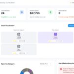
With the right visualization, complicated information can be turned into a simple chart, graph, or dashboard that people can understand at a glance. And businesses do not necessarily need an expensive analytics platform to get started. There are several free data visualization tools that can help individuals and teams turn their data into useful insights.
What Is Data Visualization?
Data visualization is the process of presenting information in a visual format.
Instead of reading a long list of numbers, users can view information through:
- Bar charts
- Line graphs
- Pie charts
- Scatter plots
- Maps
- Tables
- Interactive dashboards
For example, imagine a business wants to compare its monthly website traffic. A spreadsheet might contain thousands of individual records. A simple line graph, however, can immediately show whether traffic is growing, falling, or staying relatively stable.
That difference makes data much easier to understand.
Why Data Visualization Is So Important
Good data visualization does more than make a report look attractive. It helps people notice relationships and patterns that may not be obvious when looking at raw numbers.
It Makes Complicated Information Easier to Read
Large datasets can be intimidating, especially for people who do not work with analytics every day.
A well-designed chart can summarize important information without forcing the reader to study every individual value.
For example, a marketing manager may not need to examine every campaign record. A dashboard showing impressions, clicks, leads, and conversions can provide a much quicker overview of performance.
It Helps Teams Spot Trends
Trends become easier to recognize when numbers are displayed visually.
A line chart might reveal that website traffic has increased steadily over several months. A bar chart might show that one product is consistently outperforming others.
These patterns can lead to better questions and, ultimately, better decisions.
It Makes Business Discussions More Productive
Data is often shared between people with different levels of technical knowledge.
An analyst might understand a complicated dataset immediately, while a business manager may prefer a simple visual summary.
Visualization creates a common language. Instead of discussing rows and columns, teams can look at the same chart and focus on what the information means.
Why Consider Free Data Visualization Tools?
Not every organization needs an expensive business intelligence platform.
A small business may only need a few dashboards. A freelancer might need visual reports for clients. A student may simply want to learn how data storytelling works.
Free tools provide an opportunity to start without making a large financial commitment.
Lower Entry Cost
The biggest advantage is straightforward: there may be no software license cost for basic use.
This makes free platforms particularly useful for startups, students, freelancers, small businesses, and teams experimenting with analytics.
Easier to Experiment
Choosing a visualization platform can take time. A free option allows teams to experiment with dashboards and reporting workflows before deciding whether they need more advanced features.
Useful for Learning
Free tools are also valuable for developing practical data skills.
Beginners can learn how to:
- Import data
- Clean datasets
- Select appropriate charts
- Build dashboards
- Compare performance
- Present insights
- Create data-driven reports
Those skills can remain useful even when someone eventually moves to a paid analytics platform.
Popular Free Data Visualization Tools
Several platforms can help users create charts and dashboards without requiring a large budget. The right choice depends on the type of data, reporting requirements, and level of experience.
Google Data Studio
Google Data Studio, formerly known as Looker Studio, is designed for creating customizable reports and dashboards. Google describes it as a no-cost tool that supports charts, tables, maps, filters, and other interactive reporting features.
It can be particularly useful for marketing teams that want to bring reporting data into one place.
For example, a marketer could create a dashboard that brings together website performance, campaign metrics, and other reporting data instead of preparing separate spreadsheets every week.
Its drag-and-drop approach also makes it approachable for people who are not experienced programmers.
Microsoft Power BI
Microsoft Power BI is another well-known business intelligence platform. It is designed for analyzing information and creating interactive reports and dashboards.
For organizations already working heavily with Microsoft products, Power BI can be a natural option to explore.
Its strength becomes especially apparent when businesses need to work with larger datasets and more structured business reporting.
Tableau Public
Tableau Public is a free platform focused on creating and publicly sharing data visualizations. It provides a useful environment for people who want to practice data visualization, explore examples, and build a public portfolio.
One important point should not be overlooked: visualizations published on Tableau Public are publicly accessible. Therefore, confidential business information should not be uploaded there.
For students, analysts, educators, and people building a visualization portfolio, however, it can be a useful learning environment.
Google Sheets
Sometimes a business does not need a dedicated visualization platform at all.
Google Sheets includes built-in charting features that can turn spreadsheet data into basic visual reports. For smaller datasets and straightforward reporting, that may be all a team needs.
It is also a convenient starting point for someone who is completely new to data visualization.
How Businesses Can Use Free Visualization Tools
The applications are much broader than simply creating attractive reports.
Marketing Performance
Marketing teams can use dashboards to monitor metrics such as:
- Website visits
- Leads
- Conversion rates
- Campaign performance
- Advertising results
- Customer acquisition costs
- Social media engagement
Instead of checking several platforms separately, teams can organize important metrics into a more convenient reporting view.
Sales Analysis
Sales teams can visualize:
- Monthly revenue
- Sales targets
- Pipeline value
- Product performance
- Regional sales
- Win rates
A visual report can make it easier to identify which products, regions, or periods are performing differently.
Customer Behavior
Customer information can also become easier to understand when presented visually.
Businesses can examine purchasing patterns, engagement levels, retention, and other customer-related metrics to identify areas that deserve attention.
Website and SEO Reporting
Digital teams can use visual dashboards to monitor traffic sources, landing-page performance, conversions, and other website metrics.
For SEO teams, visualization can also make it easier to communicate changes in organic traffic, keyword performance, and search visibility to clients or internal stakeholders.
How to Choose the Right Free Tool
The fact that a tool is free does not automatically make it the right choice.
Before selecting a platform, think about what you actually need.
Consider Your Data Sources
Start by asking where your data currently lives.
It might be stored in:
- Excel files
- Google Sheets
- CSV files
- CRM systems
- Advertising platforms
- Analytics platforms
- Databases
A tool becomes much more useful when it can work comfortably with the sources you already use.
Think About Your Team
A data analyst and a marketing executive may have very different expectations from a visualization platform.
If your team is relatively new to analytics, look for an interface that is easy to understand. If you have experienced analysts, you may benefit from more advanced data modeling and analysis capabilities.
Check Sharing Options
Reports are often created for other people.
Before choosing a tool, consider whether you need to share dashboards with:
- Managers
- Clients
- Marketing teams
- Sales teams
- Executives
- External partners
The way a platform handles sharing and permissions can be just as important as its charting capabilities.
Pay Attention to Privacy
This is one of the most important considerations.
Not every free visualization platform is suitable for confidential information. Tableau specifically notes that Tableau Public is intended for public data and that published visualizations can be accessible online.
Before uploading customer information, financial records, internal reports, or other sensitive data, always understand the platform’s privacy and sharing model.
How to Create a Useful Data Visualization
A good visualization starts with a good question.
Instead of opening a tool and randomly adding charts, decide what you are trying to understand.
For example:
Question: Which marketing channel generates the most leads?
Once the question is clear, choose data that helps answer it. A simple bar chart may be more useful than a complicated dashboard filled with unrelated metrics.
Keep the Dashboard Focused
More charts do not necessarily mean more insight.
A dashboard containing 20 different visuals can actually make information harder to understand.
Start with the metrics that matter most.
Use the Right Chart
Different charts serve different purposes.
Use line charts when you want to show change over time.
Use bar charts when you want to compare categories.
Use pie charts when showing a simple part-to-whole relationship makes sense.
Use scatter plots when you want to explore relationships between two numerical variables.
Choosing the right chart can make the difference between an instantly understandable report and a confusing one.
Avoid Unnecessary Decoration
A professional dashboard does not need to be overloaded with colors, animations, or visual effects.
The purpose of visualization is to make information clearer—not to distract people from it.
Common Mistakes to Avoid
Even a powerful free tool can produce a poor report if the underlying approach is wrong.
Some common mistakes include:
- Adding too many charts
- Using the wrong chart type
- Including unnecessary metrics
- Using unclear labels
- Ignoring inaccurate or incomplete data
- Creating dashboards without a specific purpose
- Sharing sensitive information publicly
Another common mistake is focusing too much on appearance.
A beautiful dashboard is not automatically a useful dashboard. The most valuable visualization is usually the one that helps someone understand a problem and decide what to do next.
The Growing Role of Data Visualization
As businesses collect more information, the ability to interpret that information becomes increasingly important.
Marketing platforms, CRMs, websites, applications, advertising systems, and customer-support tools can all generate large amounts of data. Without a clear way to interpret it, having more data does not necessarily lead to better decisions.
Data visualization helps close that gap.
It gives teams a way to move from:
Raw data → Information → Insight → Action
The next stage is also becoming interesting as AI enters analytics. Natural-language interfaces are making it easier for users to ask questions about their data without manually building every report.
This could make analytics more accessible to people who have strong business knowledge but limited technical experience.
Final Thoughts
Free data visualization tools have made it much easier for individuals and businesses to start working with data in a meaningful way.
You do not need a huge analytics department or an expensive software package to create your first useful dashboard. A spreadsheet and a simple visualization platform can be enough to uncover patterns, explain performance, and support everyday decisions.
The important part is not the tool itself.
It is how you use the tool to answer meaningful questions.
Start with a clear objective, use reliable data, choose visuals that make sense, and keep your reports easy to understand. As your needs grow, you can explore more advanced analytics and business intelligence platforms.
For many teams, free data visualization tools are not the final destination. They are a practical first step toward becoming more confident, efficient, and data-driven.
Frequently Asked Questions
1. What are free data visualization tools?
Free data visualization tools help users turn raw information into charts, graphs, reports, and dashboards without requiring an expensive software subscription. They can be useful for analyzing business, marketing, sales, website, and customer data.
2. Why should businesses use data visualization?
Data visualization makes complex information easier to understand. Businesses can use visual reports to identify trends, compare performance, communicate results, and make more informed decisions.
3. Which free data visualization tools can beginners use?
Beginners can start with tools such as Google Sheets and Google Data Studio, while platforms such as Microsoft Power BI and Tableau Public offer additional visualization and business intelligence capabilities. The best option depends on the user’s data and reporting requirements.
4. How can I create an effective data visualization?
Start with a clear question, use reliable data, and choose a chart that fits the information you want to present. Keep the design simple, avoid unnecessary visuals, and focus on the insights that your audience needs to understand.