










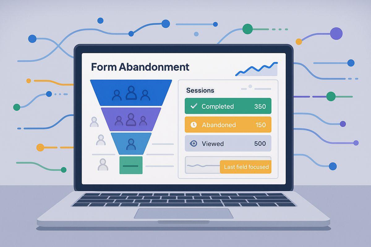
Imagine a customer visiting a website because they are genuinely interested in a product, service, or downloadable resource. They click the sign-up button, open the form, and start entering their information. Everything seems fine until they notice too many questions, unclear instructions, or unnecessary details being requested. After a few moments, they close the page without completing the process.
This happens more often than many businesses realize.
Online forms are an important part of the digital customer journey. Brands use them to collect inquiries, generate leads, register users, distribute resources, and understand customer interests. However, simply placing a form on a website does not guarantee that visitors will complete it.
Even interested customers can abandon a form when the experience feels confusing, time-consuming, or uncomfortable. Sometimes, a small issue, such as a mandatory phone number field or an unclear error message, is enough to interrupt the entire process.
For marketers, understanding these obstacles is essential. A well-designed form should help visitors move forward instead of making them reconsider their decision.
Why Do Customers Abandon Online Forms?
Form abandonment is not always a sign that customers have lost interest in a brand. In many situations, the problem lies in the experience itself. Visitors may want what a business offers, but they do not want to spend unnecessary time completing a complicated process.
Let’s explore some common reasons behind this behavior.
1. Too Many Questions Create Unnecessary Pressure
One of the biggest reasons visitors leave online forms is the number of questions they are expected to answer.
Some businesses request information that is not immediately necessary. For example, a person downloading a simple marketing guide might be asked to provide their full name, company name, job title, phone number, company size, location, and business requirements.
For the visitor, this can feel like too much effort for a small benefit.
Every additional field creates another decision. When customers cannot understand why certain information is required, they may decide that completing the form is not worth their time.
Brands should focus on collecting only the information needed at that particular stage of the customer journey.
2. Complicated Forms Make the Experience Frustrating
A form should be easy to understand, even for someone visiting a website for the first time.
When fields are poorly organized, instructions are confusing, or the layout feels crowded, visitors may struggle to understand what they need to do next.
For example, asking users to follow complicated formatting rules for phone numbers or passwords can create unnecessary frustration.
A simple, organized structure makes a noticeable difference. Clear labels, understandable instructions, and logical field placement help visitors complete the process without repeatedly correcting their information.
3. Customers Worry About Sharing Personal Information
Trust plays an important role in every online interaction.
When a form asks for personal details, customers naturally want to know how their information will be used. They may hesitate when a website requests sensitive or unnecessary information without explaining its purpose.
For instance, someone interested in receiving a free newsletter might feel uncomfortable sharing a phone number when an email address should be sufficient.
Brands can reduce this hesitation by explaining why information is collected, displaying an accessible privacy policy, and avoiding unnecessary personal questions.
Transparency helps visitors feel more confident about moving forward.
4. Poor Mobile Experiences Push Visitors Away
Many customers discover brands, explore products, and complete registrations using smartphones.
However, not every website form is designed with smaller screens in mind.
Tiny input fields, difficult dropdown menus, buttons placed too close together, and layouts that require excessive scrolling can make form completion frustrating.
A visitor might be interested in a service but abandon the form simply because entering information on their phone feels inconvenient.
Mobile-friendly forms should have readable text, appropriately sized input fields, simple navigation, and buttons that are easy to tap.
5. Unexpected Errors Interrupt the Customer Journey
Imagine filling out a long form and receiving an error message after clicking the submit button. You discover that one field contains information in the wrong format, but the website does not clearly explain what needs to be corrected.
This experience can quickly discourage visitors.
Poorly designed validation messages, technical issues, expired sessions, and forms that unexpectedly reset can all create unnecessary barriers.
Brands should provide helpful error messages near the relevant fields and preserve information that visitors have already entered whenever possible.
The goal is to help customers fix mistakes without making them start again.
6. Unclear Benefits Reduce Motivation
Visitors are more likely to complete a form when they understand what they will receive in return.
A button that simply says “Submit” does not always communicate the value of the action.
For example, a customer downloading a report should know that clicking the button will provide access to that report. Similarly, someone requesting a consultation should understand what happens after submitting their details.
Brands should clearly explain the next step and communicate the value of completing the form.
How Brands Can Reduce Online Form Friction
Understanding why visitors abandon forms is only the first step. Businesses also need to improve the experience by removing unnecessary obstacles.
Here are practical ways brands can make their online forms easier to complete.
1. Ask Only for Essential Information
Start by examining every field in your existing forms.
Ask a simple question: Does the business genuinely need this information right now?
If a visitor is subscribing to a newsletter, an email address may be enough. If someone requests a product demonstration, a name, business email, and a few relevant details might be more appropriate.
Additional information can be collected later when the customer relationship develops.
A shorter form does not mean collecting less valuable information. It means respecting the visitor’s time and focusing on what matters.
2. Make Every Field Easy to Understand
Use simple language instead of complicated instructions.
For example, instead of writing “Enter your professional communication identifier,” use “Business email address.”
Keep field labels visible, provide helpful examples where necessary, and avoid making visitors guess what information is expected.
A clear form reduces uncertainty and allows customers to move through the process naturally.
3. Build a Better Mobile Form Experience
Mobile usability should be considered during the design process rather than added as an afterthought.
Use responsive layouts that automatically adjust to different screen sizes. Make input fields comfortable to use, keep buttons easy to access, and avoid unnecessary scrolling.
It is also important to test forms on different devices and browsers. A form that works perfectly on a desktop computer may still create difficulties on a smartphone.
4. Explain Why Information Is Required
Customers should not have to guess why a business wants their information.
When requesting details such as a phone number, company name, or job title, provide a brief explanation if the reason is not obvious.
For example, a consultation form could mention that a phone number is requested only for scheduling the discussion.
Clear communication makes data collection feel more reasonable and helps strengthen customer trust.
5. Use Helpful Error Messages
Mistakes are a normal part of filling out forms. Brands should make correcting them as simple as possible.
Instead of displaying a generic message such as “Invalid input,” explain exactly what needs attention.
For example:
- “Please enter a valid email address.”
- “Your phone number must contain 10 digits.”
- “Please select a company size.”
Show these messages near the relevant fields and avoid clearing information that has already been entered.
6. Make the Call to Action More Meaningful
The final button should clearly communicate what visitors can expect after clicking it.
Instead of using generic labels everywhere, choose action-oriented wording that matches the purpose of the form.
Examples include:
- Download the Free Guide
- Request a Product Demo
- Get Your Consultation
- Create Your Account
- Subscribe to Updates
A meaningful call to action removes uncertainty and helps visitors understand the next step.
7. Test Forms Before Making Them Live
Even a carefully designed form can contain problems that are difficult to notice during development.
Brands should test the complete experience from the visitor’s perspective.
Check whether every field works, whether instructions are understandable, whether the form performs well on mobile devices, and whether the confirmation message appears after successful submission.
Testing with real users can also reveal difficulties that internal teams may overlook.
How Marketing Teams Can Identify Form Abandonment Problems
Improving forms becomes easier when marketing teams understand where visitors are experiencing difficulties.
Instead of making random design changes, businesses can use customer behavior and website performance data to identify specific problems.
Form completion rate: This measurement helps marketers understand how many visitors successfully submit a form compared with those who begin it.
Field-level analysis: Tracking where visitors stop can help identify questions or fields that create unnecessary friction.
Device-based performance: Comparing desktop and mobile completion rates can reveal whether a form is difficult to use on certain devices.
User feedback: Short feedback questions and usability testing can help explain why visitors leave without submitting their information.
A/B testing: Testing different form layouts, field counts, instructions, and call-to-action messages helps businesses understand which changes improve completion.
These insights allow brands to make decisions based on actual customer behavior rather than assumptions.
The Role of Better Form Experiences in Modern Marketing
Online forms may appear to be a small part of a website, but they influence important marketing activities.
A complicated form can interrupt lead generation, reduce registrations, discourage newsletter subscriptions, and create unnecessary gaps in the customer journey.
On the other hand, a well-designed form makes it easier for interested visitors to take action.
This is particularly important for businesses that depend on digital campaigns. Marketing teams invest time and resources in attracting the right audience through search engines, social media, email campaigns, and paid advertising. If visitors encounter an uncomfortable form at the final step, some of that effort may be wasted.
Reducing friction helps brands create a smoother connection between customer interest and meaningful action.
The objective should not be to convince every visitor to submit their information. It should be to make the process straightforward for people who genuinely want to engage with the brand.
Final Thoughts
Customers do not always abandon online forms because they are uninterested. Sometimes, they simply encounter more effort than they expected.
Too many questions, confusing instructions, privacy concerns, mobile usability problems, and unclear next steps can all prevent visitors from completing a form.
Brands can address these issues by simplifying their forms, requesting only necessary information, improving mobile experiences, and communicating clearly throughout the process.
Ultimately, a good online form should feel like a natural continuation of the customer journey, not another obstacle standing in the way.
When businesses respect their visitors’ time and make every interaction easier, they create a better digital experience and give interested customers more reasons to move forward.
Frequently Asked Questions
1. Why do customers abandon online forms?
Customers often abandon online forms because they contain too many fields, confusing instructions, privacy concerns, or technical issues that make the process difficult.
2. How can brands reduce online form abandonment?
Brands can reduce form abandonment by removing unnecessary fields, simplifying instructions, improving mobile usability, and making the submission process quick and convenient.
3. Do shorter online forms improve conversion rates?
Shorter forms can improve completion rates by reducing the effort required from visitors. However, the ideal form length depends on the information a business genuinely needs.
4. How does mobile-friendly form design affect customer experience?
Mobile-friendly forms make it easier for visitors to enter information, navigate fields, and submit details on smartphones, helping reduce frustration and improve the overall experience.