
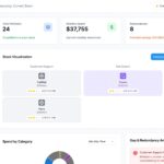










Businesses collect an enormous amount of data every day. Sales numbers, website visits, customer interactions, marketing results, financial records, and operational metrics all tell part of the story.
But having access to data does not automatically lead to better decisions.
The real challenge is making sense of that information and finding the insights that actually matter. This is where data visualization tools can make a significant difference.
Instead of asking teams to work through rows of spreadsheets and lengthy reports, visualization tools turn complicated information into charts, dashboards, graphs, and other easy-to-understand formats. When data is presented clearly, businesses can spot opportunities, identify problems, and make decisions with greater confidence.
What Are Data Visualization Tools?
Data visualization tools are software applications that transform raw data into visual representations.
Depending on the type of information being analyzed, they can create:
- Bar and column charts
- Line graphs
- Interactive dashboards
- Heatmaps
- Geographic maps
- KPI reports
- Performance dashboards
- Trend analysis
The purpose is not simply to make data look attractive. A useful visualization should help someone understand what is happening and, more importantly, what they may need to do next.
For example, looking at monthly sales figures in a spreadsheet may not immediately reveal a problem. A simple line graph could quickly show that sales have been declining for several months.
That difference can save valuable time.
Why Data Visualization Is Important for Modern Businesses
Data-driven decision-making has become a major part of modern business strategy. However, decision-makers often do not have the time to examine every individual data point.
Visualization helps bridge that gap.
When information is presented visually, people can often recognize changes and relationships much faster than they can from a table of numbers.
1. Makes Complicated Information Easier to Understand
Large datasets can quickly become overwhelming.
Imagine trying to analyze thousands of customer records manually. Even if all the information is accurate, finding meaningful patterns can take considerable effort.
A well-designed dashboard can summarize that information and highlight the metrics that matter most.
For example, a business could use a dashboard to see:
- Which products are selling the most
- Which regions generate the most revenue
- Where customer demand is increasing
- Which marketing channels are performing well
This gives decision-makers a clearer picture without requiring them to examine every row of data.
2. Helps Businesses Spot Trends Earlier
One of the biggest advantages of visualization is the ability to recognize trends.
A sudden increase in website traffic, a gradual decline in sales, or a change in customer engagement can be difficult to notice in raw data.
Visual charts make these movements easier to see.
For instance, a line chart showing monthly revenue can immediately reveal whether performance is improving, remaining stable, or moving in the wrong direction.
Identifying these patterns early gives businesses more time to respond.
3. Supports Faster Decisions
Business decisions often need to be made quickly.
Waiting for someone to manually collect information, prepare a spreadsheet, and create a report can slow down the decision-making process.
With automated dashboards, important metrics can be brought together in one place.
Managers can quickly review performance, investigate unusual results, and decide where attention is needed.
The result is a more responsive approach to business management.
How Different Departments Use Data Visualization
Data visualization is not limited to data analysts. Almost every department can benefit from using it.
Marketing
Marketing teams deal with data from many different sources, including websites, advertising platforms, email campaigns, social media, and CRM systems.
Visualization can help marketers understand:
- Campaign performance
- Website traffic
- Lead generation
- Conversion rates
- Customer engagement
- Marketing costs
- Return on investment
Instead of looking at each marketing channel separately, teams can bring key metrics together and compare performance more easily.
Sales
Sales teams can use dashboards to monitor the health of their pipeline.
Common metrics include:
- Leads generated
- Opportunities created
- Conversion rates
- Revenue
- Sales targets
- Pipeline value
- Regional performance
A visual sales dashboard can help managers quickly identify whether the team is on track or whether certain areas require attention.
Finance
Financial data can become complicated very quickly, particularly as an organization grows.
Visualization can make financial information easier to monitor by presenting revenue, expenses, budgets, margins, and cash flow in a structured format.
Executives can then get a quick overview of financial performance without having to work through lengthy reports every time they need an update.
Operations
Operational teams can use visual dashboards to monitor processes and resources.
For example, a company may track:
- Inventory levels
- Production performance
- Delivery times
- Resource utilization
- Operational costs
- Process efficiency
If a particular process starts slowing down, a dashboard may make the problem visible before it has a significant impact on the business.
Types of Data Visualization Businesses Can Use
Different types of visualizations are useful for different questions.
Bar Charts
Bar charts are useful when the goal is to compare different categories.
For example, a business could compare sales across five product categories.
Line Charts
Line charts are ideal for showing movement over time.
They can be used to track revenue, traffic, customer growth, leads, or other metrics that change from month to month.
Pie Charts
Pie charts can be useful when showing how several categories contribute to a single total.
However, they are generally easier to understand when there are only a small number of categories.
Heatmaps
Heatmaps use differences in visual intensity to highlight patterns.
They can be useful for understanding customer activity, website behavior, geographic performance, or other datasets where certain areas need to stand out.
Interactive Dashboards
Interactive dashboards bring multiple metrics and visualizations together.
Users may be able to filter results by:
- Date
- Product
- Location
- Customer segment
- Marketing channel
- Sales representative
This makes it easier for different users to explore the same dataset from their own perspective.
Key Benefits of Data Visualization Tools
When implemented properly, data visualization can improve both everyday reporting and strategic decision-making.
Better Understanding of Data
Visual representations can make complicated information easier for non-technical users to understand.
Faster Access to Insights
Instead of spending hours searching through spreadsheets, teams can quickly identify important changes and patterns.
Improved Collaboration
A shared dashboard gives different departments a common view of important business metrics.
More Consistent Reporting
Automated dashboards can reduce repetitive manual reporting and help teams work with standardized metrics.
Faster Problem Identification
Unusual changes in performance can become easier to recognize, allowing teams to investigate problems earlier.
More Confident Decisions
When decision-makers can clearly see what the data is showing, they can make choices based on evidence rather than assumptions alone.
What Makes a Data Visualization Effective?
Simply creating a dashboard does not guarantee better decisions.
Poorly designed visualizations can create just as much confusion as a complicated spreadsheet.
An effective visualization should answer a clear question.
For example, instead of creating a dashboard that displays every available marketing metric, a company could focus on a more useful question:
Which marketing channels are generating the highest-quality leads?
The dashboard can then display the metrics needed to answer that question.
A good visualization should generally be:
- Clear
- Relevant
- Accurate
- Easy to navigate
- Focused on important metrics
- Designed for its intended audience
The goal should always be understanding, not decoration.
Common Data Visualization Mistakes
Businesses can make several mistakes when building dashboards and reports.
Including Too Much Information
More data does not always mean more insight.
If a dashboard contains dozens of charts and metrics, users may struggle to identify what actually matters.
Choosing the Wrong Chart
A visualization should match the type of information being presented.
Using a complicated chart when a simple bar or line chart would work can make the information harder to understand.
Ignoring the Audience
An analyst may want detailed information, while an executive may only need a few high-level KPIs.
The same dashboard should not necessarily be designed for everyone.
Focusing Too Much on Design
A dashboard can look impressive without providing useful information.
Good design should support the data rather than distract from it.
Using Poor-Quality Data
Visualization cannot fix inaccurate or incomplete data.
If the underlying information is unreliable, even the most attractive dashboard can lead to incorrect conclusions.
How to Choose the Right Data Visualization Tool
There are many visualization platforms available, so businesses should consider their actual requirements before selecting one.
Start With Your Data Sources
First, identify where your data currently lives.
It could be stored in spreadsheets, databases, CRM systems, analytics platforms, advertising platforms, or cloud applications.
The visualization platform should be able to connect with the sources that matter to your business.
Consider Ease of Use
If marketers, sales representatives, or managers need to create their own reports, the platform should be accessible to people without advanced technical skills.
Check Integration Options
Good integration can reduce the need for manually moving information between systems.
Think About Scalability
A tool that works for a small dataset today may need to support significantly more information as the company grows.
Pay Attention to Security
Businesses should also evaluate user permissions, access controls, authentication, and other security features when dealing with sensitive information.
Data Visualization and Artificial Intelligence
The relationship between data visualization and artificial intelligence is becoming increasingly important.
Traditional dashboards generally tell users what happened.
Modern analytics platforms are moving toward helping users understand why something happened and what could happen next.
AI can assist with tasks such as identifying unusual patterns, summarizing trends, finding relationships within datasets, and allowing users to ask questions using natural language.
For example, instead of manually searching through multiple reports, a business user could ask:
“Why did our sales decrease last month?”
An analytics system may then help identify the products, regions, customer groups, or other factors associated with the change.
This makes data analysis more accessible to people who may not have advanced analytical skills.
Turning Data Into Action
The real value of data visualization is not the chart itself.
The value comes from what happens after someone understands the information.
Suppose a marketing dashboard shows that one campaign is generating significantly more qualified leads than another. The business can investigate why that campaign is performing better and potentially adjust its budget or strategy.
Similarly, if an operations dashboard shows increasing delivery delays, managers can investigate the underlying process before the issue affects more customers.
In other words, visualization creates a bridge between data and action.
The Future of Data Visualization
As businesses continue to generate more information, visualization will become an increasingly important part of analytics.
Dashboards are becoming more interactive, automated, and intelligent. AI-powered features are also making it easier for people to explore data without relying entirely on technical teams.
The future is likely to move beyond static reporting toward systems that combine:
- Real-time data
- Automated insights
- Predictive analytics
- AI-assisted analysis
- Interactive dashboards
- Natural-language queries
This will allow businesses to spend less time preparing reports and more time using information to improve decisions.
Final Thoughts
Data is only valuable when people can understand and use it.
Data visualization tools help businesses turn complicated information into clear insights that teams can act on. From marketing and sales to finance and operations, visual analytics can make performance easier to monitor and trends easier to recognize.
But successful visualization is not about filling a screen with charts. It is about presenting the right information to the right people in a way that supports a specific business decision.
When businesses combine trustworthy data with clear visualization and thoughtful analysis, they can make decisions faster, identify opportunities earlier, and respond more effectively to changing market conditions.
Ultimately, the power of data visualization lies in one simple idea: make the data easier to understand so people can make better decisions.