
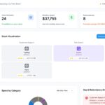










Modern businesses generate enormous amounts of marketing data every day. Website traffic, social media engagement, email performance, customer journeys, advertising campaigns, and CRM systems all create valuable information. However, raw numbers alone rarely provide meaningful insights.
This is where data visualization in marketing analytics becomes essential. Charts, dashboards, graphs, heatmaps, and interactive reports transform complex datasets into visual stories that marketers can understand quickly and act on confidently.
Instead of spending hours reviewing spreadsheets, marketing teams can instantly identify trends, measure campaign performance, discover customer behavior, and make data-driven decisions that improve business growth.
What Is Data Visualization?
Data visualization is the process of presenting marketing data using visual elements such as:
- Charts
- Graphs
- Dashboards
- Maps
- Heatmaps
- Infographics
- KPI Scorecards
Visual reports make large datasets easier to understand and help teams identify patterns that may be difficult to notice in spreadsheets.
Why Data Visualization Matters in Marketing
Marketing teams collect information from multiple platforms including:
- Google Analytics
- CRM software
- Email marketing platforms
- Social media channels
- SEO tools
- Paid advertising platforms
Without visualization, comparing all this information becomes difficult.
Visual dashboards simplify reporting by combining data from different sources into one easy-to-read interface.
Benefits include:
- Faster reporting
- Better decision-making
- Improved campaign optimization
- Easier KPI tracking
- Stronger collaboration between teams
Key Marketing Metrics to Visualize
The most useful marketing dashboards often include:
Website Performance
- Users
- Sessions
- Bounce Rate
- Average Session Duration
- Conversions
SEO Performance
- Organic Traffic
- Keyword Rankings
- Click-Through Rate
- Backlinks
- Indexed Pages
Email Marketing
- Open Rate
- Click Rate
- Unsubscribe Rate
- Conversion Rate
Paid Advertising
- Cost Per Click (CPC)
- Return on Ad Spend (ROAS)
- Cost Per Acquisition (CPA)
- Impressions
- CTR
Social Media
- Engagement
- Reach
- Shares
- Followers Growth
Types of Data Visualization Used in Marketing
Line Charts
Perfect for showing marketing growth over time.
Example:
- Organic traffic growth
- Revenue trends
- Monthly leads
Bar Charts
Useful for comparing campaign performance.
Example:
- Facebook vs LinkedIn ads
- Email campaign comparison
- Product sales
Pie Charts
Show percentage distribution.
Example:
- Traffic sources
- Device usage
- Customer demographics
Heatmaps
Help marketers understand user behavior.
They reveal:
- Most-clicked buttons
- User scrolling behavior
- Landing page engagement
Geographic Maps
Display customer locations.
Useful for:
- Regional sales
- International marketing
- Local campaign analysis
KPI Dashboards
Executive dashboards combine multiple metrics into one screen.
Typical KPIs include:
- Revenue
- Leads
- Conversion Rate
- ROI
- Marketing Spend
Benefits of Marketing Data Visualization
Faster Decision Making
Visual reports allow teams to identify issues immediately.
Improved Campaign Performance
Poor-performing campaigns become easier to identify and optimize.
Better Customer Understanding
Visualization reveals:
- Buying behavior
- Customer journey
- Preferred channels
- Engagement trends
Stronger Team Collaboration
Marketing, sales, and management can work from the same dashboard, reducing reporting confusion.
Better ROI Tracking
Visualization makes it easy to monitor:
- Campaign cost
- Revenue
- Customer acquisition
- Marketing effectiveness
Best Practices for Effective Marketing Dashboards
To create useful dashboards:
- Focus only on important KPIs
- Avoid cluttered visuals
- Use consistent colors and labels
- Update data regularly
- Design dashboards for different stakeholders
- Keep charts simple and easy to understand
Common Mistakes to Avoid
Many businesses make visualization mistakes such as:
- Including too many charts
- Tracking irrelevant metrics
- Ignoring business goals
- Using outdated data
- Creating overly complex dashboards
The best dashboards answer business questions clearly and quickly.
Popular Marketing Analytics Visualization Tools
Some widely used platforms include:
- Google Looker Studio
- Google Analytics 4
- Microsoft Power BI
- Tableau
- HubSpot Reporting
- Microsoft Excel
- Zoho Analytics
Each tool helps businesses transform raw marketing data into actionable visual insights.
Future of Marketing Data Visualization
Artificial Intelligence is changing how marketers analyze data.
Modern dashboards can now:
- Predict future trends
- Detect unusual performance automatically
- Generate AI-powered insights
- Recommend campaign improvements
- Automate reporting
As AI continues to evolve, marketing visualization will become even more interactive, predictive, and personalized.
Conclusion
Marketing success depends on making informed decisions quickly. Data visualization bridges the gap between raw data and actionable insights by turning complex information into clear, meaningful visuals.
Whether tracking website traffic, measuring campaign ROI, analyzing customer behavior, or monitoring marketing performance, visual dashboards help businesses work smarter and make faster decisions.
Organizations that invest in effective marketing analytics and visualization gain a competitive advantage through better planning, improved customer understanding, and stronger business growth.
Frequently Asked Questions (FAQs)
1. What is data visualization in marketing analytics?
It is the process of presenting marketing data using charts, dashboards, graphs, and visual reports to simplify analysis.
2. Why is data visualization important for marketers?
It helps identify trends, measure campaign performance, improve reporting, and support data-driven decisions.
3. Which metrics should be visualized?
Website traffic, conversions, SEO rankings, email performance, social engagement, advertising ROI, and customer acquisition.
4. What tools are commonly used for marketing dashboards?
Google Looker Studio, Google Analytics 4, Power BI, Tableau, HubSpot, and Zoho Analytics.